Monday, 31 March 2008

The Return of the Tilt and Shift Lens


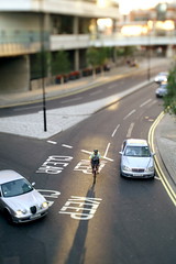
Toy BikeSome time ago, I got myself a tilt and shift lens for my Minolta, because I was interested in expermenting with camera movements, but didn't want to buy a view camere. I was interested in things like the Scheimpflug Principle which allows you to extend the dof of field parallel to the ground and the opposite effect where you restrict the plane of focus to a small slice of the image. I used the lens to take a number of images, that made cars look like toys and it was good fun for a while, but eventually I stopped using it.

Fast forward to today and after reading "Lighting for Portrait Photography" , I was inspired by the images of Tobias Titz to get the T&S lens out and use it for portraits. In Tobias's white bodies series, he used the camera movements to throw everything out of focus except for the heads, a white background and cross processing make the body blend into the background.
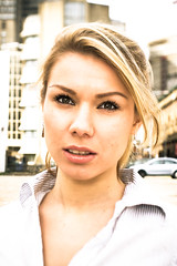
Cross ProcessedI was fortunate to be assisting flickr member quochuy on a shoot near London Bridge, and he allowed me to take a few shots myself. It was just after midday and the sun was high and left, illuminating the buildings in the background. I got Huy to hold up a silver umbrella for me to put the model in the shade and I used a flash gun in a white shoot-through umbrella behind me over my left shoulder to fill with controlled light. The lens aperture was set between f2.8 and f4 and I used the maximum amount of tilt on the lens to focus just on the eyes. I deliberately overexposed, so as to keep the contrast between the model and the background low.

I did miss a trick, because the tilted plane of focus was running from the eyes down to the ground. This meant that sometimes background objects I didn't want in focus snuck into the pictures. I should have tilted it from the eyes to the sky and then it would have been less noticable.

I processed the images in lightroom and fiddled about with split-toning to give the images a cross processed look. I'm pretty pleased with the results, the eyes positively pop, though I would say that I need to refine the technique a little. You can see more images on my flickr page

Saturday, 29 March 2008

Lighting for Portrait Photography


Lighting for Portrait Photography is pretty much a recipe book for different portrait photography lighting techniques. It generally has a large image on one page and then a 3D rendered reconstruction of the image on the other, along with a key showing some information about the photograph such as, shutter speed, aperture, focal length etc. and finally a paragraph or two of text.

The book starts off with some general information about equipment, stylists and the indstry and then moves on to the images, starting with ambient light and moving on to more and more complicated flash setups. Drawing from a pool of 23 photographers, there's a pretty good variety of images showing a number of lighting techniques, and some of them are quite inspiring. There are a few standouts that are not to my taste, which is fine, because if it only showed shots that I liked, I would probably be missing out. I would still have liked to have seen some more iconic images and more contemporary styles, like Jill Greenberg's, Dave Hill's or the Ogalthorpe look, but I guess the book is a product of its time. Having said that, I'm not sure how old it is, this revised edition was published in 2007.

Now this book could have been pretty awesome, its tuned in to what people ask for all the time on the forums. People want recipes for images, so they can try to reproduce them. They want to know what aperture and shutter speed and above all they love lighting diagrams. On those counts the book delivers. It will certainly appeal to a lot of people but for me it falls down on a number of counts.

I found that the lighting diagrams and the key information, were not quite complete and made for a distracting read. For instance you might see that a 120mm lens was used and then if you look carefully at the diagram you might notice that a medium format camera was used. It would have made it a lot easier to read if the key contained all the pertinent information including things like the type of film and ISO.

In some places the key inormation appeared to be wrong. For instance the image of Angelina Jolie, was supposed to have been shot with ambient light only, but the key said it was shot with ambient and flash. In another place the key said an aperture of f22 was used, but the depth of field was minimal, so either the key was wrong or there was some information about how the image was taken that was missing somewhere.

The text describing the photos was often too little and inconsistant from image to image. Sometimes the lighting detail was very minimal and I wasn't feeling the love. The writing just didn't have the warmth and passion that other books have. In many cases it felt like not quite enough thought went into the text. There's a lot of white space in the book it was a shame not to see it filled.

Don't get me wrong, its still a good book, you just have to read the other reviews on amazon too see that many people love it, but in my opinion it falls short of kick-ass. Its good to see ambient, flash and hot lights in the one book and there is plenty in there to inspire, so I would still recommend it. Especially as it is very reasonably priced.

Friday, 14 March 2008

National Portrait Gallery


I was looking for an online image of this wonderful portrait of Martin Clunes by Trevor Leighton (believe me the thumbnail doesn't do it justice). Google threw up a link to the National Portrait Gallery, and I was pleasantly surprised to see that they were selling prints at rather good prices. An A4 print for £5 or an A2 print for £12.50 seems a bargain to me. So its not going to be an investment, but its an affordable way of getting prints and helping to keep the National Portrait Gallery going.

While you are at it, why don't you go down there and have a look. Entry is free, but you do have to pay to see the Vanity Fair Portraits, which should prove to be a good show.

Wednesday, 12 March 2008

Faces : Jane Bown


Jane Bown is a celebrity portrait photographer for the observer and has been photographing celebrities for over 50 years. Now I have have mixed feelings about celebrity photography because I quite often find that the pictures don't always stand up on their own, but not so with Jane's portraits.

I'll admit it I'm a real sucker for black and white portraits, shallow depth of field, close cropping and plenty of dramatic shadow is what I want. This book delivers it in spades. Jane shoots exclusively in black and white, using only continous light. This sometimes means that some of the shots are a bit blurred or not as sharp as some people would like, but the composition and character that she captures overrides such onsiderations and the images remain powerful.

The attraction of this book for photographers, is that each picture has a short paragraph or two detailing the conditions of the shoot, giving an insight into the work of a celebrity portrait photographer. Sometimes it will be about how she thought about the composition, or it might be about how she got the light she needed. There are a few neat tips in the book and you don't get to travel much lighter than with a camera a couple of lenses and a 150W bulb for emergencies.

It doesn't come across as an instructional book, more of a genteel conversation from one photographer to another, with many very fine pictures. The print quality isn't the best but then a lot of these images would have originally been newsprint, so they reproduce quite well.

Hey maybe I should give out marks for these reviews? Or maybe not? Its a good book. Check it out if you see it in the book shop.

Friday, 7 March 2008

The Moment It Clicks


I would pretty much guarentee, that if you are subscribed to this blog, you have probably bought this book or are thinking of buying this book but I'm going to review it anyway.

There are plenty of books that follow a similar format to this. A picture, an anecdote and some information about how the image was taken. Micheal Grecco's Lighting and the Dramatic Portrait is a good example of this style of book. Those of you expecting detailed recipe's with lighting diagrams will be disapointed, the technical information is light but gets to the heart photo. This is by no means a criticism, The Moment it Clicks is absolutely jam packed with great photos, entertaining anecdotes and pithy quotes.

Joe's writes as though he's sitting next to you in a bar, talking in a what I assume is a New York accent, there's even a chapter dedicated to bar talk. Unfortunately, I'm unable to do accents when I'm reading to myself, so it comes across to me like Dick Van Dyke in Mary Poppins, but no matter, every page jumps out at you, and a lot of the insight he dishes out, will stick with you for life. The pictures, as Joe would say, are all shot with available light, any &*%%@^ light thats available, so there's plenty to excite strobists and strobophobes alike.

Did I mention that this book was packed? I have never seen a book of this style so packed with material. I was about half way through the 240 pages and thinking that this was incredibly generous, I would have been satisfied with half the amount of content.

The geardos among you will drool over the photos and lists of Joe's kit, which get a full four pages towards the end of the book and there is a colourful glossary of terms full of explanations of photographic terms and slang, as well as footnotes on the pages where the terms are used.

You just know you have to buy this book don't you?

Thursday, 6 March 2008

I'm back


My Current Wife in the Blue LagoonIve been a bit quiet of late because I've been busy getting married up in Scotland and then my current wife and I headed off to Iceland for our honeymoon. We took nearly 3000 photos in scotland and Iceland and our wedding phoographer gave us a CD with 300 images, so we have been busy sorting them into albums and making a slideshow for the wedding party this Saturday. No doubt I will be taking loads of Photos at the party too. After the party is over that will be it until the sordid affair and a messy divorce

(only kidding).

I did start drafting a blow by blow account of our trip to Iceland but after writing 2000 words about the first couple of days, I thought it would be extremely unlikely that anyone would read the whole thing. So you are going to get the abridged version.

Iceland was brilliant, it was a shaky start, there was a lot of rain for the first two days and we didn't get to see the best Reykjavik had to offer, but the Blue Lagoon made up for it, we were blessed with an amazing sunset and the place was quite magical.

We went on a jeep safari after it had started snowing and we saw loads of amazing landscapes. We tried to get up on a glacier, but the weather was so bad that it was impossible to continue and the snow made it very hard to get a decent photo because it kept getting on the lens and with white sky and white land it made the photos a little flat looking.

On our final full day we went on a golden circle coach tour and it was spectacular, the weather was great. Lots of blue skies and we experienced some amazing sights. Chief among these were the Gulfoss water fall and the Geyser.

It is very expensive to eat in Iceland but the food really is very good. We recommend Vin & Skel on the main shopping street. Everything we had was cooked to perfection and it only came to about 11,000 Krona for the two of us. Considering the standard of the food was so high you would quite easily pay similar prices for food of that quality in London.

But for a real budget eating experience, the hotdog stand by the Radisson Hotel does great hotdogs for 210 Krona. Bill Clinton had eaten hotdogs from the very same stand. I have to admit, the thought of Clinton clutching a hotdog made me feel slightly queazy, but I got over it.

I want to go back to Iceland as soon as possible, who wants to join me? Icelandic strobist meet anyone?


Created with Admarket's flickrSLiDR.