I was asked to take some corporate headshots in the office for my Company's website. The challenge was that nobody would be able to spend more than a few minutes getting their picture taken and not everyone would be available on the same day. So taking a leaf out of Kirk Tuck's book; after setting up the lighting to my satisfaction, I made a diagram, wrote down all the flash and camera settings and took a couple of photos of the setup.
It was a pretty simple two light setup. I used one light on the background and another light camera right through a half-silver shoot-through umbrella. In order to get a bit of fill on the left hand side I brought over a a flip chart and placed it on the opposite side to the umbrella. The half-silvered umbrella was interesting. The shadows are a bit harsher than I'm used to with the white shoot through umbrella, which is why I used the white board, but the result isn't unpleasant. But I will probably be using the white ones when my new ones are delivered.
The majority of the shots were done on one day, but with the lighting diagram and notes I was able to set-up, shoot, and break down, in under 15 minutes and that included time travelling in the lift. Even so I found I was having to adjust the exposure slightly to account for differences in distance. And the lighting direction was not quite the same.
One portrait is still left to do, but in the meantime we photoshopped an existing picture to make it match the others. Its interesting to note that the picture of Bill was cut-out to make the white background, and this inexpert job took me longer to do than taking a photo would have.
Wednesday, 25 February 2009
Wednesday, 18 February 2009
Richard Ansett
Update:The date of Richard's Private viewing has changed to the 26th March not the 23rd as previously reported
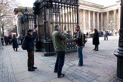
I appear to have posted the last article prematurely as is was supposed to follow on from this one. So this post might make the previous one make more sense...
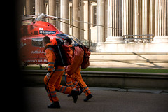
I was wandering about one lunchtime when I heard the sound of a helicopter landing. So I rushed over to the British Museum where the air ambulance had landed, just in time to take a quick snapshot through the railings of the paramedics rushing to the scene of the accident. I hung around taking photos of the helicopter for a while, and then spotted a photographer and his assitant, photographing Danny Wallace. When it looked like he was finished up I wandered over and introduced myself.
The photographer was Richard Ansett, an award winning photographer, whose work has graced the Tate Modern and the National Portrait Gallery. Though Richard hadn't heard of the strobist, his kit is almost strobist in style. He was using a Norman flashhead with a 5 inch reflector triggered with a pocket wizard. He told me they were great little flashes that made it look like you had been working all day. When I told him that I was admiring his voice activated lightstand, he informed me that he sells them, he imports them cheap from abroad. I'm not sure whether to believe him. There is certainly no price list on his website. Perhaps he sells them under the counter?
If you have a look at his portfolio you will see quite a few examples where he uses a simple one light setup to drop the ambient light and create moody images. On some of his indoor shots you will see a heavy yet soft edged shadow that works nicely as a graphic element. Nice. Go take a look
I contacted Richard by email and this is what he had to say.
I've been using Normans since I started and I was trained on them originally by photographers working on film and I had to guess the exposures without a lightmeter..great training..they still are the most portable of light sources and combined with the pocket wizard are incredibly versatile when attached to an assistant; the shoot and lighting can evolve through a shoot very quickly as you don't have to keep stopping to move the stand.
the flash duration is incredibly fast so any moving or jumping works very successfully. The only problems with Normans are that they ar not 100% reliable, lots of little things can go wrong with them , which is managable on an editorial shoot but advertising demands more consistency and i use prophoto 7b's on location..
you did well to notice the soft edged shadow..this s very important to me..I use an improvised baby soft box so the light spread is minimal and it gives the work a painterly feel I think..the best way to show the quality of the soft box is in the transition from the lit area into the shadow..
One light is preferred and if I use more I try and disguise the fact that I am 'over' lighting..it sounds easy but lighting correctly with one light source off camera is a real creative challenge and it is very easy to get the mood wrong.. feather lighting is the key with a small soft box (changing the angle on the subject).. the smallest movements can affect the mood of a picture completely so a human light stand it great for this.
I have travelled extensively with the normans and they have give me amazing results that conceal the small amount of time I am with some subjects, working quickly and therefore understanding all the technical elements, gives me my best and most spontaneous performances; and even on a bare head with reflector the light source is not un- flattering..
Richard has a solo show at a contemporary art space - Tenderpixel from 24th March, Private View is the 26th March and Richard has kindly offered to let my readers come along. If you would like to go to the private viewing please drop me an email and I will let you know what you need to do to get in.
TENDERPIXEL GALLERY
10, Cecil Court, London WC2N 4HE
P: 02073799464
Monday, 16 February 2009
Accident
One of the shots that I took at the British Museum when the helicopter landed, was a grab shot through the railings. Pictured here, you can see that the railing was in shot creating the deep shadow on the left of the frame. I was too slow to capture the running medics in the right of the frame so they are running out of the picture, not leading in. All the action is on the left half of the image and the right half is pretty much devoid of interest. The whole thing might be considered a compositional disaster and yet the image speaks to me. My head tells me to reject it, but my heart tells me its a keeper.
So how can my heart explain it to my head? The black stripe is reminiscent of a film that hasn't been wound on properly. To me it harks back to my youth when I was rubbish at loading film, it has some emotional significance for me. The medics running out of the shot while breaking the compositional rule of leading the eye out of the shot creates a sense of urgency that might not have been as strong had they been in the right of the frame. Finally the right hand portion of the frame draws the eye back because it is brighter than the left of the frame.
Had I taken the shot I had intended to take I don't think this image would have been as good. What do you think? Bullshit or not?
Monday, 9 February 2009
Drew Gardner Cheap
No I'm not saying that I had a bad date with Drew or anything, its just that Drew is going to be releasing a new video at Focus On Imaging on Sunday 22nd Feb. Its called "Location Lighting with Drew Gardner" and The Flash Centre are taking pre-orders for it for just £20. I haven't watched it yet, but at that price I may well take a punt.
Eric Joakim, Regional Sales Manager, Phase One, said: ‘This is a superb instructional DVD taking the viewer through every aspect of a major location shoot (actually 2 of them!) from the planning stage right through to exactly how the final image is achieved! Drew is overwhelmingly generous with the information that he divulges, more than any other DVD of this type that I have seen.”
You can view a preview on You Tube.
Saturday, 7 February 2009
Neil Turner
No, the photo on the left isn't Neil Turner, its a photo of me that Neil took in December, at a special strobist event arranged by David Hobby. Neil Turner is a freelance photographer who worked as a staff photographer for the last 14 years for the Times Supplements, now known as TSL Education. He is best known by strobists and non-strobists for the excellent articles that he wrote on dg28.com, breaking down various techniques he used on assignment. When I first encountered his website I actually read through every single article in one night. Unfortunately, I haven't visited it often since then because it doesn't have an RSS feed. This year Neil is expanding his website and has started what he calls a pre-blog blog. Basically a blog but without an RSS feed. However in order to get regular updates you can now sign up to Neil's mailing list and he will send you updates.
Watching Neil at work is pretty cool. At the strobist meet he was the first to get set-up and start shooting. The rest of us were gawping at the location in the Brunswick Centre and Neil was looking for shade so he could work the flash against the ambient. In the shot above. Neil was using a vivitar 285 HV with a shoot through umbrella. Putting me in the shade and lighting me with the flash meant that he could expose the sky and buildings independently of the subject... er.. me. Its perhaps not as easy as it sounds because the light was constantly dropping as the sun disapeared. My own attempts at a similar shot were pretty dismal, but this was Neil's forté and he made it look easy.
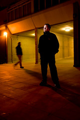
Later on when the sky had gone black we worked against the building floodlights and Neil helped me pull off this shot of Alex from The Flash Centre on the right. I had already taken a shot with a random stranger walking past and as I looked at it on the screen I told Neil that I liked it, but the lighting was off and I would never get someone else walking through the shot like that again. Neil simply said, "take the shot and I'll walk into the position for you". The lighting setup was pretty simple, a SB28 camera left with a coroplast grid pointed at Alex's face.
Visit Neil at www.dg28.com
Thursday, 5 February 2009
Barbershops
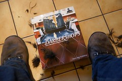
The Book Warehouse on Southampton row has a table with clearance items outside it. While walking to work the other day I had a browse of it and found an absolute gem of a little book. Barbershops by Tally Abecassis and Claudine Sauvé. Reduced from £16.99 down to £3.99 I didn't expect it to be great, but was rather pleasantly surprised because the book is a design masterpiece. I snapped it up immediately
The book as you can guess, documents the disappearing world of barbershops, using a beautifully arranged collection of photographs, mixed in with retro graphics and quotes from the subjects. The book is full of beautiful environmental portraits of the barbers and their clients, detail shots of their hands, tools and brick-a-brack.
Whilst I loved the many portraits and detail shots, what really impressed me was the way that they took shots that were unpromising in their own right, such as signage and arranged them in a collage to create something that was greater than the sum of the parts. There must have been an element of pre-planning in this because there were collections of similar photos from each shop. They must have gone in with a shooting list. Get a photo of the back of everyone's head, get a picture of scissors etc. Its something worth remembering as a photographer if you don't do it already.
The words in the book show that they really built a rapport with the subjects, despite being two women in a male refuge. The collection of quotes and anecdotes along with the way that they were presented, complimented the photography beautifully.
I'm very lucky to have found this copy at such a great price. Its highly recommended. Take a look at Claudine Sauvé's portfolio. She takes exceedingly good photos.
Subscribe to:
Posts (Atom)