 A while back I wrote about a concept called shared boundaries which causes the perspective of an image to collapse. You can read it here. This concept didn't come to my head unbidden, oh no, I read about it in a awesome but extraordinarily dry book called Perception and Imaging: Photography--A Way of Seeing
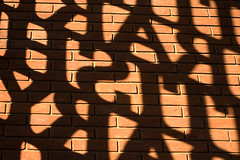
Another concept from the book is figure ground confusion I touched on this briefly in the previous post. When you look at a picture, you usually quickly establish which part of the picture is the background and which is the foreground, but some images make it hard for the brain to establish this and the foreground and background will flip-flop.
The image above is an example of this. I took it at the gates of the British Library. I have no idea if this works for you, but for me there are three graphical elements working to create a figure ground confusion. The first and most obvious is that the light and shade competes to be the foreground. As I study the picture, the letters grab my attention first because writing is a strong attractor, then the bright spaces between the letters takes over and my perception flips between the two. But the third element that takes over is the pattern of the bricks and this can jump to the foreground and relegate the light and shadow to the background.
Perception and Imaging: Photography--A Way of Seeing


No comments:
Post a Comment