Tuesday, 7 December 2010

Sisters.. Triplets.. I'm just watching


Sisters, Triplets, I'm just watching

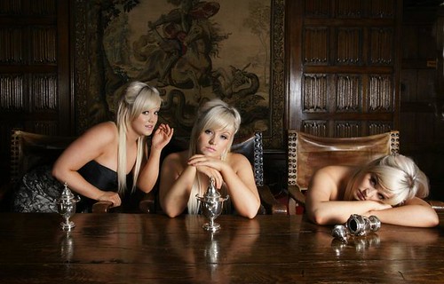
Recently I was at Ingatestone Hall on a group shoot with the London Strobist Meetup Group. It was a fantastic venue with some wonderful features that I quite miserably failed to fully take advantage of. Early on in the day I found myself in the dining room with the beautiful Stef. But the room was so big it really needed a few more models. But all I had was Stef, so I decided to have a stab at doing a composite shot. All I had to do was set the camera on a tripod and get Stef to pose for me in three different positions and I could create a scene where I imagine that Steph had triplet sisters by layering the images and erasing parts of the image to get all three of her in the final flattened layer.

The light was fairy simple. Two white shoot-through umbrellas either side more or less at 45 degrees, both with SB28 flashguns. The right hand flash was a stop more powerful than the left just to get a little contrast going. I kept the lights a little way back so the the illumination across the scene would be more even than if I had them up close.

It all sounds pretty straight forward but I'm not 100% happy with the final result for a number of reasons. I think the first comes down to pre-visualisation. I didn't have a clear idea of what the final image should look like. Its good to leave some things to serendipity but really you have to have a good idea of what the composition will be. Of course one way around this is to shoot tethered and do the post processing on the fly. It doesn't have to be a lot of work. Just pop the image into a layer, lasso the girl invert the selection and delete. Its just a quick guide and you can do the real work later.

Shooting tethered would have helped me to resolve the second issue that I have with my image. Because I was shooting at 20mm on APS-C the perspective was a little stronger than I would like. This meant that the left hand Steph looks smaller than she should because she is further away, and the right hand Steph looks bigger because she is closer. Had I realised this at the time. I would have rearranged the furniture so that I could use a longer focal length, or I could have kept the models all on the same plane.

Lessons learned for next time.

Wednesday, 10 November 2010

Where Children Sleep


If the Harry Potter's step family the Dursly's were ever to buy him a present then I think it would be the this book, because it would illustrate to him that living in a cupboard below the stairs is the lap of luxury in comparison to the place where many children around the world sleep at night.

James Mollinson's book is not meant to be a campaign to raise support for needy children, though it may well be seen that way. It is really just a series of environmental portraits of children for a variety of nations and a variety of backgrounds. These are environmental portraits with a twist, because he has shot the children separately from the backgrounds using a neutral backdrop and presented the child portraits alongside their environment.

The pictures alone speak volumes, but I think the project comes alive with the text that accompanies each photo, describing the life and ambitions of each child. From the very richest to the very poorest.


It's James's hope that children will read this book and think about inequality and perhaps figure out a way to respond in their own lives. Certainly my six year old daughter Christina enjoyed flicking through the book looking into the lives of other children. She was very much interested in the room of Kaya, a four year old from Japan, whose room was neatly stuffed to the rafters with dolls and soft toys. Christina told me, "I'd like to play with them"


My eldest daughter Caitlin read through the book and the story she found most shocking was of 4 year old pageant queen Jasmine Peters from the USA. Caitlin told me that she could understand how children could fall into poverty, but not one of constant rehearsal and preparation for beauty pageants.

As I wrote earlier the book is not a campaign but James was aided by Save the Children. Seeing as they get no money from the sale of the book I have decided to donate the difference between the retail price of the book and the discounted price on amazon to Save the Children. Furthermore, I will donate my amazon commission from any sales of the book made in November and December.

I have set up a just giving page where I will put my donations, I would hope that you could donate at least the amazon discount back to Save the Children if you buy the book.

If you are in the United States, the amazone links should automatically link to amazon.com, but if they don't, you can get to the book from this link

Tuesday, 2 November 2010

The Half


It must have been two years since I went to see Simon Annand's exhibition at the National Theatre and I was struck by the beauty of the images, since then I have lusted after his book every time I've seen it in a book shop, but never enough to pay the full price. So I when I spotted it in the Book Warehouse on Camden High street for £7.99 I had to have it. There are still a couple of copies left so if you are in the area and want to get a slightly tired copy at a good price, get down there before they are all gone.

So what's it about? Simon Annand spent 25 years photographing actors in the half-hour before the performance, there are over 300 photos, many of which are outstanding, the cover being a great example of the best. Some are posed if not by Simon then by the actors themselves others appear to be taken at moments when the actors are deep in thought, seemingly unaware of the camera. Its these moments that really grab me.

There isn't much in the way of words other than a forward by Simon and an unpretentious introduction by Michael Kustow. Each photo is simply annotated with names, locations and dates. Its both a document of the actors, the space they inhabit in the dressing room and a keen observation of their behaviour in that private space and time. A great little collection of photos.

If you are unable to get a hardback copy for £7.99 Amazon sell a paperback copy at a reasonable £13.00, those of you in the good old US of A might find it a little less reasonable.

Monday, 18 October 2010

Loading a Polaroid 4x5 back badly


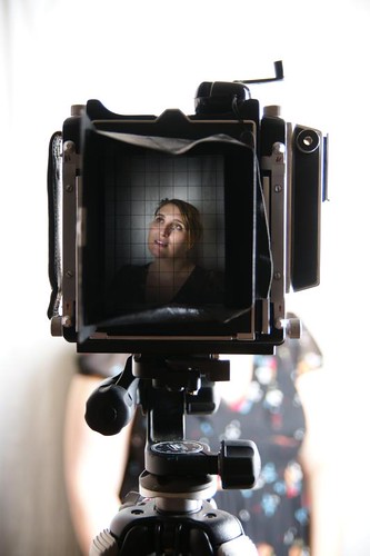
ViewfinderThe time had come for me to give Philip Payne his 4x5 camera. So I used up the last frame of Fuji FP100C-45 instant film that I had loaded in David Rowland's polaroid back and packed it up. I wish I had made more of the opportunity to use the camera but it was so big and bulky that it was easy to leave it in a cupboard and forget about it. But I did have some fun with it. The big instant prints are kind of gratifying and I enjoyed floating the emulsion off to make wrinkled little prints.

Its very different way of shooting. You have to be careful to do everything in the right order and almost have to rehearse each shot otherwise you risk exposing the film before you meant to. I would set the shutter to "T" mode open up the lens to maximum aperture to focus on the ground glass and then once everything was in focus I would set the shutter and aperture back to the appropriate settings for the shot, put the film back in, prime the shutter and pull the dark slide out ready to take the shot. Focussing in poor light is a complete nightmare. I think if I were shooting with one regularly I would want to use continuous lights.

One of the ironies of shooting instant film on a large format camera is that you end up taking a "Polaroid" with a digital camera to avoid wasting precious instant film.

Of course none of that is anything to do with this post. What I'm really posting about is that I needed to return the Polaroid 550 back to David with film in it, seeing as that is how he gave it to me. I thought I may as well shoot a video of it and post it up here for anyone who hasn't seen it done before. Its not terribly intuitive, but makes complete sense once you have done it once.

Unfortunately I was doing it by memory, which is not such a good idea when you start getting a bit older because the memory starts to fade a bit. The other problem is that I couldn't do a dry run. If I hadn't loaned out my Hasselblad I would have practiced on the smaller back, but it wasn't available so I had to do it in one take. I should let you see for yourself how bad the video is. A bit like acorn antiques all the important action is happening out of frame. And I managed to confuse myself half way through. Just take a look for yourself. I promise I'll do it better when I get my hasselblad back.


Does any of that make sense to you? If not here is what you need to do. First of all take out the dark slide from the back. You won't be able to open it with it in. Open the back up. There is a hinged cover up by the rollers. Pull that open and the whole thing should unfold. Then just lay the film in the case with the black paper facing the hole were the dark slide was. You don't need to thread anything through any holes, just lay it flat and make sure the paper is not curled under itself. Close the back up and replace the dark slide. You should now have a black paper tab sticking out and the white tabs should be just visible. Remembering that you need the dark slide in place! Pull on the black tab quickly straight out of the pack. Don't do it slowly like I did in the video. You should now have a white tab hanging out of the back. That's it done.

When you take the shot, just yank on the white tab and it will pull the first sheet up to the rollers. You don't want to do what I did in the video and yank it before you take a shot as you'll waste the film. After you take your first photo, pull the grey tab through the rollers in one smooth movement and you'll have your first sheet of instant film developing in your grubby mits.

Monday, 11 October 2010

Pro Digital Fashion Photography


Bruce Smith has set out to show you everything you need to set out on the road to being a fashion photography. Whilst I don't think that it gives up all of fashion photography's secrets, it's a pretty good starting point and there is plenty to consider when you embark on a fashion project of your own.

The link here is for the US version of the book but I have the UK version. The UK version now appears to be out of print and worth a lot more than I paid for it. However I contacted Bruce and he has confirmed that the US version is identical to the UK version.

The first chapter on equipment is fairly brief and explains all the choices you can make. It covers cameras, lenses, computer hardware and software, location lighting, gadgets and cases. It doesn't go into a great deal of depth, but he explains from personal experience why he uses each piece of kit.

Despite the fact that the book was first published in 2008 it's already out of date, Moore's law dictating a tenfold increase in diskspace. I can't imagine anyone owning a 4 Megapixel DSLR let alone using one to shoot fashion. But guess what? That doesn't really matter because the message is that there isn't just one tool, you choose the right tool for the job at hand.

The next chapter is on building your team. The emphasis is on the importance of your team and your relationship with them. The team members are your models, makeup artists, stylists and assistants. It also covers casting and shooting tests with agencies.

The chapter on pre-production covers all the elements you need to pull together for a successful shoot. From choosing a location, to building a set. Its also talks about how to get your ideas and the timing of the shoot. Theres a lot of information in this section and you could use this to give yourself a checklist of things to plan for on your own shoots. Some of the discussion is about the practical aspects of the choices you can make such as daylight studio vs location. The pre-production chapter also dicusses lighting. The lighting section has an extraordinarilly detailed description of how to set up a white background using 4 lights. Running over two pages this description has multiple setup shots and tells you what f-stops to meter at. There follows 30 pages on different lighting techniques, but these are more general and less detailed than the white background setup, but no less valuable. Lots of diffeent scenarios are discussed, from ambient, to ambient plus flash and pure flash photography. It would certainly get you off to a flying start if you wanted to reproduce the lighting styles that Bruce has shown in this book.

The next chapter on production is about what happens on the day. Some of the sections in this chapter may seem more suited to pre-production for instance the section on knowing your market and knowing your client's needs. also knowing what the layout will be, but it is something you would do well to remember on the day.

There is a good section on composition and how it relates to the thing you are selling and the layout of the finished shot. The subject of composition would make a book in its own right, so he doesn't go into great detail here, but relating it to your final goal is the important thing.

There is some good advice about creating energy on a shoot and on directing models and he also discusses exposure and metering and white balnce. Time management gets a couple of pages devoted to it and there is also a discussion about usage for the advertising, editorial and catalogue markets.

The chapter on post production has some discussion about editing, making your selections and a few pages of retouching for the most frequent types of thing that Bruce might do. However it is a very small section.

The penultimate Chapter is on marketing. Covering promotion, developing style, building and showing a portfolio. There are also a couple of pages devoted to fee structures.

Finally there is a short chapter devoted to inspirational photographers. La Chappelle, Latigan, Perou and Rankin each get a full page photo and a page of text describing their work.

So that's the end of this mammoth review. as you can see a lot is covered in the book. Not all of it in great depth, but it will lay down a framework for you to work from and build upon. I guess you could call it fashion photography 101.

Monday, 4 October 2010

Photography and the art of seeing


Freeman Patterson's book bills itself as a workshop and like any workshop it has exercises that you can follow to reinforce the lessons. The book is built around three principles of observation, imagination and expression and offers techniques and insight for developing these areas.

The section on observation concentrates on overcoming barriers to seeing and the exercises are designed to help you do that. Its about breaking rules, thinking laterally, studying the familiar and clearing your mind to make room for observation.

The section on imagination is fairly short and in many ways the barriers to imagination are the same as the barriers to observation. Imagination, abstraction and pre-visualisation are discussed with good examples and exercises.

The section on expression is about conveying mood or feeling in your photographs. The photos that Freeman uses to illustrate expression are mostly landscapes that have been designed to express a feeling such as joy or a concept such as dreaming.

A large part of the section on expression is a discussion of the unique properties of cameras. Its actually very low on technical detail and I guess you might see that as a good thing or a bad thing depending on your level of technical ability.

The remainder of the book is about visual design and how this might relate to expression and emotion. The sort of things discussed are the use of colour, line and tone. Freeman has a very different approach to a more technical work like The Photographer's Eye or David Prakel's Composition. This book has a more personal and emotional style to it.

The book throughout is illustrated with Freeman's photos. For the most part they are landscapes often very delicate in tone and composed to the point of abstraction. His other photos are a little less inspirational. I also felt that the images in the book were let down by the printing. They seemed over-sharpened lacking in detail and there was some banding on some of the images. I would have liked to have seen more variety.

For me personally I didn't feel that I got as much out of it as I could have because I didn't do the exercises some of the lessons have stuck in my addled mind but its a book that for me requires re-reading.

Having said that, I wouldn't hesitate to recommend it to someone who was doing a 365 project because it would be easy to incorporate the exercises into your daily routine. If you are the kind of person who would work through exercises I think you could get a lot of value out of it.

Monday, 27 September 2010

Master Lighting Guide for Portrait Photographers


I believe this to be one of the best books I have read so far on lighting for portrait photography. It should have a broad appeal to those looking for lighting recipes and also for people looking beyond that. Though it appears to have been written for film users it talks about digital and quite frankly it doesn't make a great deal of difference. It’s also aimed more at studio work and big flash than small flash but you will find some of the concepts transferable.

The book starts with an introduction to the nature of light from the physics through to the quality of light. Don’t let the thought of physics put you off because it is pretty simple stuff about how the light travels in straight lines and reflects off surfaces. Nothing too taxing.

Following on from that is a section on lighting equipment and terminology, covering a wide range of modifiers, including what Joe McNally calls V-Flats. Here they are called bookends.

There are a couple of pages explaining what lighting ratios are and the term is used throughout the examples in the book. There is nothing really magic about lighting ratios and it’s really just a shorthand a way of communicating the relative balance of the lighting. It’s not something you absolutely need to know and most of the examples in the book give a lighting ratio and the f-stops used to achieve that. However there is one glaring omission and that is that there is no instruction on how to use an incident light meter. You would need one to meter the lights to achieve the ratios that you are interested in. However it’s not a huge problem these days as most digital users will mix their light according to taste rather than fixed lighting ratios.

The book goes on to demonstrate a number of portrait styles and the effects that different types of light modifier have on the style of shot. for instance the butterfly lighting portraits are re-shot with no less than 8 different light modifiers to show the effect that each has on the final image. I think that is the payload for even some of the more jaded strobists who think they know it all. All the shots in the book are backed up with a lighting diagram.

The lighting isn't described as a one size fits all solution, it's a starting point and Christopher Grey takes you through each of the choices and the changes that he makes along the way to the final portrait.

In part two he takes you through more portraits in different market segments often using the basic lighting schemes from part one as the starting point. Along the way showing tips, such as how to apply powder makeup, how to close the sitter's pupils, use flare and overexposure. I was particularly taken with his Hollywood portraits which I thought were beautifully done.

All in all a very good book that should appeal to beginners and more advanced flashers.

Monday, 20 September 2010

The War of Art


In a bit of a departure from the usual fare, I'm reviewing a self-help book. Written by Author Steven Pressfield it is aimed to help writers and other creative people overcome the obstacles that prevent them from doing the work that they love. The book was recomended to me by Kirk Tuck, himself a prolific photographer, author and blogger. He told me that it has saved more creative lives than a defibrulator.

When the book arrived I immediately locked mytself in the toilet and started reading it. By the time I got to page 21 I relalised that the book was warning me about precisely what I was doing. Instead of sitting in the toliet reading a self-help book what I really should have been doing was editing photos from a recent shoot.

Resistance is the first of three themes in the book. It is a force from within and takes many forms. Steven describes them all with examples drawn from his and other people's life experiences. In my case it took the form of a fear of failure that made me resist looking at the photos I had taken. Getting the book gave resistance an easy way out. What would be easier than turning my back on my fear and doing something pleasurable like reading a book?

Even when I had realised what resistance was up to. it still tried to seduce me away from my work. It told me that reading the book was important. I should finish it. But by then the game was up. The book had unveiled the enemy within and shown it in its many colours. I now have a name I can pin on it. For me this was the most revolutionary thing in the book. Now that I understood what I was doing to myself I could fight back against resistance and it has certainly helped me on a number of occasions.

The second theme is turning pro, resistance and fear will prevent many people from taking that step. Turning pro means dedicating your life to the pursuit of your art. The book discusses what it means to be a professional and how it makes it easier to fight resistance. Like this part of the review its a pretty short section and even if you have no intention of becoming a professional its a good section to read

The final section is the most controversial because it gets a little religious. Its about inspiration. The author sees inspiration as divine, the muses are real and god wants you to be the best you can be. Personally I think this is hogwash, but there is still plenty of goodness when it discusses inspiration and staying true to your vision.

Like most books of this kind, there is a lot or reinforcement and repetition, but this works to help the concepts stick. I think that this book has the potential to be life changing its certainly made a difference to me. It has enabled me to recognise when I'm working against myself and given me a spur to get out of the slump I have been in for most of the year. I would recommend it for the section on resistance alone.

There is also a kindle edition of The War Of Art that would work out a bit cheaper

Sunday, 12 September 2010

DIY Budget Tripod Mount for a Bowens S-Type Speedring


Last week I made an impulse purchase. I needed a new softbox and I wanted one with a grid. I had been planning on getting a pop-up softbox, either an EZ-Fold or a Westcott Apollo, but I found the EZ-Fold to be a bit flimsy and some people had told me that they had found that it was tricky to angle the apollo. Not only that, but neither are particularly cheap. So I was procrastinating and then when I was buying something for my wife made an impulse purchase of this Dynasun 60x90cm lightbank.

What the hell was I thinking? I wanted an pop-up softbox and then bought myself a traditional softbox with a bowens s-type mount. I didn't even have a clue how I was going to mount the damn thing to a lightstand. But when it arrived I noticed that the holes for the struts were about the same size of the larger tripod mount. So I did some googling to see if I could figure out how to put a thread on the holes which would allow me to attach the ring using an umbrella mount.

Tripod mounts come in two sizes. The 1/4 British Standard Whitworth, which is the size that will screw into the bottom of your camera. Or the 3/8 British Standard Whitworth which you usually find on the tops of light-stands. To make the threads in the sockets on the speedring you need a 3/8 BSW tap. You also need a tap vice, which you us to turn the tap in the hole. The tap and the vice can be bought on ebay for round about a tenner.

Using the tap couldn't be easier. Just insert the tapered end into the socket and start turning clockwise. Every now and then give it a half turn back to clear some of the clippings and keep going till you hit the bottom. It simply unscrews and that's it done. I made a short video so you can see just how quick and easy it really is.


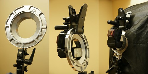
With the ring mounted on a light-stand you can use a clamp to mount a flash in the hole. I prefer using a clamp to an adaptor because I have the clamps with me anyway so it means I don't have to carry any extra bulky kit with me. Its bad enough carrying the clamps.

threerings


So having solved the problem of mounting the softbox I just had to find a quicker method of assembling it. I figured that out too. I can assemble the softbox in around 30 seconds. If you have seen my previous softbox assembly video you'll be a bit skeptical, but the secret is to have the softbox pre-assembled with just the speedring detached. You can have it rolled up in your bag ready to go. Just unroll it, attach the speedring and you can have it set up on a light-stand as quickly as an ez-box. It doesn't look like someone sat on it either.

Here is a video of me popping mine up.

Monday, 26 July 2010

Beautiful Light With One Flash


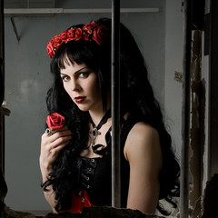
BarredA week ago I went on great strobist meetup in Harold Wood Hospital, a derelict hospital near Romford. Within 5 minutes of arriving, when all the other photographers were racing off, I had already spotted my shot next to the makeup room. There were several holes in the walls and I wanted to use these as a frame for the lovely Emma (aka Darke Mort) who didn't need any makeup.

The first series of shots that I took were through a jagged hole in the wall and though I got some nice shots, I was struggling a little to get the right framing. But then we moved to the next room where there was the big square hole in the wall.

The lighting for this couldn't be simpler, the colour of the wall was more or less white, so I pointed an SB28 at the wall in front of Emma at 24mm zoom. This made a nice big soft light source in front of Emma that also threw a little light on the room. Had I used an umbrella as I had in the previous room I would have got a lot more spill on the wall behind and positioning would have been tricky.

Photographing someone through frame is a rather interesting excercise in itself. Apart from useing the frame within the frame, it makes it easier to visualise different compositions. You should try it one day

Thursday, 20 May 2010

Tineye reverse image search


There will come a point when you will ask yourself, "How can I find out who is using my images". Most search engines are keyword searches so you are only going to find your image if a keyword has been used or if the person using your images has linked to you, then you might be able to use a google search, but its not something you can easily do. However there is a search engine called TinEye where you send it your image and it will search for the image without using keywords.

Its now even easier to use TinEye because if you register with them, you can install a plugin for your browser that will allow you to search by right clicking your image and selecting the search item from the menu.

TinEye isn't infallible as it still has billions of images to index, but it is very fast and sometimes the results are amazing. I got TinEye to search for one of my most popular images and it found several matches. One of which was a photo of a painting of my photo on a German website that had sold a limited edition of paintings. Having found this derivative work I could, if I was organized enough, go and get myself a lawyer to sue for copyright infringement. Of course it wouldn't be simple because I would be crossing national boundaries and derivative works aren't the simplest of cases.

One of the things that I believe the TinEye technology will be good for, is as a search engine for orphan works. One of the things that would be required for workable orphan works legislation is a reverse image search engine. If people could seed the TinEye database with their own images, then they would ensure that their images could be discovered on an image search by someone wanting to use work for which they do not know the author. This seeding of the database could be done automatically by sites like flickr when you upload an image. I can't see orphan works legislation being workable unless something like this is put in place

Why don't you give TinEye a go and if you find an image that has been used without your permission tell us about it in the comments.

Thursday, 13 May 2010

Dean Collins: Live at the Brooks Institute


Since getting a smartphone, I have finally come to grips with instructional video. I have bought videos but not watched them because there is always some celebrity reality show or other on that my family want to watch and I if I try to watch them on my laptop I am easily distracted by the chaos at home. But with my android I can now watch them at leisure and on the move.

One of the videos I bought recently was Dean collins Live at the Brooks institute. Dean Collins was a commercial photographer and teacher who sadly succumbed to cancer in 2005. This video is of a very slick presentation he did at the Brooks Institute in front of a live audience

Shortly after the introductions there is a rather brutal cut with a screen announcing that Promotion and darkroom printing were ommited from the original program. I found this quite disapointing because when the video resumes, there is a complex diagram on the screen and a photo of a black knife on black paper and Dean starts talking about three dimensional contrast refering to the image and the diagram as though he had been talking about them for a while. I also suspect that the cut portion of the presentation would have also resolved some confusion over the chromazones portion of the presentation later on.

The presentation itself is very slick. Dean had three projectors on the go, often with a setup shot, the shot and a diagram all at once. The man is also very funny, full of anecdotes and jokes. If anything he reminds me of Bill Hicks. There's another reason for resenting the cut portion of the seminar, missing out on all that humour.

He discusses concepts of three dimentional contrast: the shadow, the diffused value ,the highlight and the transitions between the three. His example images are taken from real shoots that he did for clients like Laura Ashley. The images do look a little dated, but thats because its an old video shot in 1991. But don't let that put you off because you will still learn plenty.

The reason I bought the video is because I wanted to learn more about his Chromazones system. Its an empirical system that he uses to reproduce colours from a swatchbook on any neutral toned background be it black or white. You really do have to listen carefully for this bit and I had to watch it several times before I really got it. But this is another area where I suspect the missing portion of the presentation would have helped. It occurred to me that he only had three stops from middle grey to pure black, and this confused me because there should be more. But the reason for this is that the print process the system is designed for, only has a three stop range in either direction before you hit pure white or pure black. This may be explained in the missing section, but I guess I'll never know.

You'll learn stuff from this video that is very different from what you'll learn from a news based photographer like David Hobby where there are different considerations. Dean talks about the difference between lifestyle and catalogue and how to get consistent backgrounds across images when the backgrounds are different in tonality.

All in all its a great little video despite some flaws, you should learn plenty from it assuming you don't know it all already and best of all it will make you laugh. I also think that its good value for money even though its more expensive than buying a book, it engages with you in a way that makes the information more likely to stick.

You can purchase the video from http://www.software-cinema.com and there is a clip available for viewing

Thursday, 6 May 2010

Composition: David Prakel


Composition is another book by David Prakel in the basics photography series and as with the previous book that I reviewed Lighting, the organisation of the book, in common with others in the series, is very well thought out and logical. The book is broadly split into six areas: The Basics, Formal Elements, Organising Space, Organising Time, Application and Originality.

Starting with the basics there is a general discussion of the need for composition. One particular statement impressed me in the introduction.

Photography should be like jazz - an improvisatory form of music where personal expression is everything but that expression is based on a solid structure of learned chords and chord progression

I like that. With the solid backing you can then experiment within the structure and you can bend it and break it too. The basics section then goes on to discuss such things as the rule of thirds, perspective and viewpoint.

The next section talks about formal elements that pre-date photography. Line, shape, form texture, colour and so on. Again very easy to follow and fairly comprehensive encompasing ideas such as figure ground reversal and implied lines. The section on organising space is all about framing, balance, symmetry and depth of field and then organising time is about how to create an impression of the passing of time. There is a section on application which discusses how various compositional techniques are applied to different forms of photography.

Throughout these sections the book is illustrated by photos not only by the author but also from photographers like James Nachtwey and Cartier Bresson.

Overall its a pretty good read, its not quite as comprehensive as The Photographers Eye but having said that, it has one advantage over it. Composition will actually fit in a coat pocket. Its just a little larger than a paperback, which makes it a lot more convenient for reading on the move.

Friday, 30 April 2010

Confused about Metering?


I've noticed that there is a common mistake that people make about metering. You'll quite often hear people say things like: Caucasian skin is +1 stop over 18% grey so you should take a meter reading and increase your exposure by one stop. There's nothing wrong with that statement at all, until you start using an incident meter and that's where the confusion starts. People start to worry how they will be able to photograph a scotsman and a nubian in the same room if one needs +1 and the other needs -1. Fortunately you won't need to composite two shots, because the answer is simple.

There are broadly two types of meter. A reflective meter and an incident meter. Your camera comes with a reflective meter and what that does, is measure the tonality of light reflected from your subject. This meter will tell you what exposure settings to use to make whatever its pointed at look like a middle grey tone. When someone says to add a stop for Caucasian skin or subtract a stop for Black skin, they are referring to a reflective meter reading taken from the person's skin. A reflective meter will tell you how to get the tonality of former prime minister John Major but a white person will be too dark at that setting and a black person will be too light, hence the exposure compensation.

The other type of meter is an incident meter. An incident meter measures the light falling on your subject and it tells you what exposure to use to render your subject's true tonality. So you hold the meter close to your subject and point it at the camera. And the meter will tell you how to make a black cat look black or a Scottish lass look pale blue. Put them next to each other and provided the light falling on them is the same, they should both be properly exposed. I own a Sekonic L-308S flash-meter which is capable of both incident and reflective metering it doesn't have the fancy features that more expensive flash-meters have but it does the job. If you don't have a fancy flash-meter you can take an reflective meter reading off of a grey card.


So hopefully that clears things up. With a reflective meter you have to adjust the exposure for the subject,but for an incident meter you don't need any compensation.

Seeing as most people use reflective meters, its worth explaining a little more about them. Reflective meters in cameras come in many different flavours these days. Centre weighted, matrix metering and and spot. Centre weighted and matrix metering are meters that look at the overall scene and give you an average value based on a number of factors. Centre weighted gives more priority to the centre of the image and matrix metering can be almost black magic on some cameras, consulting a database of scenes to determine an exposure based on a number of readings taken at different points. Determining how to compensate for these meter readings is really a matter of understanding the scene and getting a feel for how your meter on your camera behaves.

Spot metering on the other hand gives you a meter reading from a small spot in the centre of the image. So if you want to get a good exposure of black skin you might want to take a spot reading of just the skin and then do your -1 adjustment.

If your camera doesn't have a spot meter or the spot is too large to isolate the part of the scene you want to meter, here is a tip for you. If you have a zoom lens, you can zoom in on the part of the scene you want to meter. Or you could always swap for a longer lens, take your meter reading and swap back.

I hope you find this article useful and if it inspires you to buy a flashmeter, please consider getting one from the amazon links on this page. The commission I earn from the amazon affiliate links gets spent on books that I review here. If I can tell my wife that they are paid for by the blog she doesn't beat me.

Sunday, 25 April 2010

48 Hour Interview


What did you do with your weekend? This was the question posed by Reg Gordon on the strobist forum a couple of weeks ago. My weekend wasn't all that, I was recovering from a chest infection, but Reg's weekend was spent putting together an extraordinary project. Reg pulled together a team of people to create a magazine from scratch in 48 hours. It was such an inspiring project that I decided to ask Reg a few questions about it.

Where did the inspiration come from to do the magazine?

The inspiration came from Tuffer's magazine (24 Hour Magazine) plain and simple. I looked at it one evening while watching tv and went to bed thinking about it. The following day I woke up and decided it was just what I needed to give myself a kick up the ass, but I didn't want to just copy it so I spent a few days brainstorming till I could come up with a spin. I'm very aware of the small community in Galway and the lack of coverage of anything that isn't advertising related so that was to be my focus..

How important do you think it was to have such a tight timescale?

The timescale was vital. If it wasn't done in 48 hours it would just be another magazine. Also since everyone donated their time, in reality a weekend was all I could ask for.

How did you put together your creative team?

What amazed me was how easy it was to pull the team together. I called a meeting in a local pub one sunday evening and put it to everyone and the look on their faces was something Ill remember for a long time. A look of incredulity followed by a slow smile as they realised how cool it could be. One person turned me down as he didn't think it could be done.....

Did you all know each other well before you started?

Id say I knew everyone there but no-one well. We had all worked together in a professional capacity in various newspapers so I knew they could get it done. What shocked me was how easy they made it and the fact that it was WAY above what I imagined.

I imagine it being like some sort of big brother house task. Once everyone was in the room how quickly was it before people were able to run out and start pulling together content?

We started pulling content straight away. The first shoot was at 12 am on Friday. I was back in the office at 8 am and Dave Ruffles came in at 9 with his market images. 915 I was in another room picking out fonts. 10.30 someone was working on a logo......

There's a focus on the arts, did you already have the contacts in place or were you cold calling to get your interviews?

We pretty much cold called everyone but some people came to us a lot of clothing stores wanted to get involved but we didn't want to go down that route.


The Blue Teapot asked for coverage and I didn't think twice. I've met the guys a few times and what they do brings a tear to my old cynical eye. All the images are taken with either a 50 mm or a 24 mm and the actors didn't lose focus once.

When you were looking for people to interview and photograph where the people you asked receptive or did you get many rejections?

Like I said we only got one rejection and even they said they'd love to be involved but couldn't commit 100 percent. You've gotta respect that

Was everyone in a creative role or were you able to get some people to volunteer for donkey work?

We all did everything. That was my favourite part of the weekend. The complete lack of egos. Everyone just worked together. It really was the most perfect example of teamwork I've ever been a part of. I don't know if it was the lack of money involved or the fact that we were all there with the same goal but no one was in anyway possessive of their work. A designer could be working on a page and someone else would walk over " why not try a ......" and it would be tried. If it looked better it stayed. Like I said no egos.

Galway City is quite a small town, compared to say London. Do you think this made it easier for you?

Yeah the size of Galway was a big part of it. I'm quite well known in Galway so once I called people, even if they didnt know me they knew my name so doors opened quickly. If I lived in London Id try to keep it local too. I'm sure there's a lot of boroughs in London with bigger populations than Galway with just as much going on.

What was your biggest challenge? Would you do anything differently next time?

The biggest challenge came at 5 pm on Saturday when I realised that we had a s*** load of content but had nothing laid out. I printed out all the photos Id picked for inclusion and laid them out on the floor in front of me. It was at exactly that moment that I realised the enormity of the task. I looked up and saw all the designers looking at me, waiting for me to make a decision. I was in charge.


I came VERY close to walking out, I don't think I've ever felt such pressure. I actually went blind for a few seconds, screwed up all my courage and BOOM off we went

If some other crazy person were to attempt to do this, what advice would you have for them?

If someone else wants to do this I say go for it. You really wont regret it.


The one thing I'd advise is get a really good office manager who will keep you focussed .Keep them away from creative and keep them practical. Don't go out drinking till the last night. Be prepared for some MASSIVE moments of self doubt. Remember that its fun.

If anyone want to contact me for advice feel free

You can read 48 hour magazine here if you want to be inspired. If you want to get in touch with Reg you can contact him through his flickr account

Monday, 19 April 2010

Sonia Hotshoe With 3.5mm Jack Socket


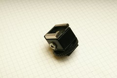
Sonia Hotshoe Adaptor 3.5 JackWhen David Hobby started his campaign to abolish the PC connector over on the strobist blog a while ago. It prompted me to contact the manufacturer of the Sonia brand of hot shoe adaptors to see if they had any plans to include a 3.5mm jack socket in their product. The Sonia All Purpose adaptor is a rock solid adaptor with a cast metal hot foot, two female and one male pc connector,plus a test button. Replace one or more of the PC conectors with a 3.5mm socket and it really would be a very nice accessory. You could leave it on your lightstand and not worry about it falling apart and no pc cables trailing out of it like my modified Kaiser hotshoe adaptor.

When I got in touch with Sonia they told me that they already had a product with a 3.5mm phono socket but they weren't supplying it to the UK. So I next contacted Colin at colinsfoto.com to suggest and that he try out the new product and not only did he order them in, he very kindly sent me a sample.

Sadly it isn't my dream hotshoe adaptor. Sonia have opted for a plastic foot instead of the metal foot of their all purpose adaptor. However the plastic construction appears to be very solid and the only potential weakness is the foot. The foot is a hot one so if you want to mount it on a tripod you would need to also get a tripod mount. Sonia do a metal and plastic mount which is a very snug fit on the hotshoe adaptor even before you screw down the locking ring. Put together its a very solid little package that looks like it would survive being left attached to a tripod in a bag.

The hotshoe adaptor only has the one 3.5mm jack socket, which is fine as far as I'm concerned however I was a little sad that it doesn't come with a test button. So I'm going to have to carry on trying to jam my fat sausages into the test button on my SB28

So that's it. Like I said its not my dream adaptor but as it stands its a great replacement for the Kaiser shoes that I have been using with my Elinchrom skyports and at £9.99 its reasonable value compare to other products. One thing you will need to consider is adding on the price of mono patch cables. I had some that were supplied with my skyports which is great, but I have yet to find a suppliers of them online. Colinsfoto also sell corded versions at the same price so that might give you a bit more value if you don't mind the dangling cord. Or you could just get a screwlock cable

In the interest of full disclosure, yes I did get to keep the sample, but I don't get any commission or anything else.

Friday, 16 April 2010

Martin Schoeller


I was out wandering the streets one lunchtime and wandered into a... ahem...bookshop in Soho, where I found this wonderful book of Martin Schoeller's images. The book is about A3 in size with high quality printing. The books starts with a short biography of Schoeller and then goes straight into the photographs. The first set of images are from his documentary work with the New Jersey police who he shadowed for three months on the nightshift. These stark images are a huge contrast to the wonderfully polished headshots of celebrities that he took for his book Close-up a number of which appear in this book. Of all the portraits in the book, my favourites are the environmental portraits. Each portrait tells a story or has a little twist about it, Tarantino escaping from a straightjacket surrounded by doves in flight. Cesar Millan standing surrounded by leaping dogs in a street full of muddy water. Even the cover shot of Angelina Jolie licking a bleeding lip tells has a story behind it and that's just a headshot. Some of the environmental portraits are like a Gregory Crudeson on a small scale. The only thing that lets the book down is that it contains advertising but its easy enough to ignore and if it keeps the price down, that's fine by me.

Amazon has a great deal on this book and others in the Stern Portfolio range, you can pick them up for as little as £10 in the uk, unfortunately the price is not quite so good in the states, for a change. Usually rip-off Britain is double the price.

Thursday, 25 March 2010

Medium format strobist on the cheap


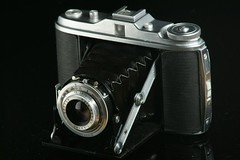
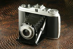
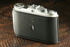
Agfa Isolette IThere is a stall in the stables market in Camden Lock that sells old cameras and other nicknaks. I managed to pick up this lovely old Agfa Isolette I for 20 pounds. Built in the 1950s it sports three shutter speeds and a flash sync connector. It takes 120 roll film and like my Hasselblad it takes a 6x6 square negative. The lovely thing about this camera is that it folds up small enough that you can fit it in a coat pocket. The downside is that you have to focus using the distance scale on the lens.

A common fault with these cameras is that the focusing ring is quite often suck. The lubricant that was used when they were made turns solid and you cant focus. My one was very stiff when I got it, but holding it under the hot air dryer in the gents toilets at work softened the lubricant enough to allow it to turn freely. Unfortunately the focusing ring came free of the barrel which meant I had to screw it back on and check that the camera was still able to focus properly.

Checking focus turned out to be relatively easy. The first thing I did was make a rudimentary focussing screen out of a translucent dvd case. I just cut a square out of it roughly 6x6cm and taped it in place where the film would be. Then I turned the lights off in the front room and turned on the TV with the camera three feet from the TV. I was able to see the TV was in focus at the correct distances market on the ring. To check infinity focus I drew a cross on the screen and set the focus ring to infinity and the aperture to its maximum f4.5. Then I took my DSLR with a 135mm lens and placed it lens to lens with the Agfa. With them both focussed to infinity and set at their maximum aperture I placed a strong light behind the Agfa and looking through the viewfinder of my DSLR I could see that the cross on the focussing screen was in focus.

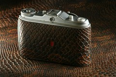
I actually picked up a second example of this camera on ebay not long after finding the first and was in even better condition. It seems that not all Isolette I cameras are made equal, this one has a sliding cover for the frame counter which makes it more suitable for colour film and the lens design is a little more elegant. The new one is more shiny and none of the leatherette is peeling. So given that I had one good Isolette and one slightly scruffy and peeling one I decided to pimp my Agfa.

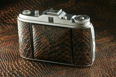
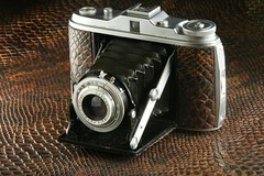
I got some brown snake PVC off ebay for next to nothing, carefully peeled off all the leatherette using a craft knife in places where it was still strongly bonded. Next I scraped of all the old brown glue with a craft knife and gave the naked camera a wash with a mild solvent, actually my daughter's nail varnish remover wipes with aloe vera.

While the solvent was evaporating off the case I used the original leatherette as a template for cutting the snakeskin. I used a craft knife and a steel ruler on a kitchen cutting board. The trickiest bit was cutting the window for the frame counter. I'll be the first to admit that it wasn't the neatest job but its good enough for me.

Attaching the new leather was entertaining. I used a spray glue that I found in Maplins, which meant that I had to mask all the areas on the camera that I didn't want to make sticky. I also covered the new leather with gaffa tape and trimmed it so that I wouldn't get any glue on the visible parts of the leather. With the leather and the camera masked off I sprayed the camera and the back of the leather panels with the spray glue. I was expecting a fine mist, but instead it was like the end scene of a gangbang movie, sticky strands flying everywhere. Very unpleasant. I left the camera and panels until the glue was touch dry and then carefully attached them. I did have a bit of trouble with the rounded corners because they kept popping up, but I solved this by wrapping the affected areas in gaffa tape which held it tight while the glue set.

The new leather is thicker than he original, but it doesn't look out of place and it gives the camera a really nice texture and heft. It makes the original feel less substantial. Truth be told, I would rather have had bright red python that the more old fashioned brown snake, but I still love it. Here are some pictures of both cameras

Pristeen Isolette
Sleeping Snake

Germanic Post War Modernity
Snake Eye

Sleak Rear View
Snake Rear View

Thursday, 18 March 2010

Polaroid PoGo Printer Review


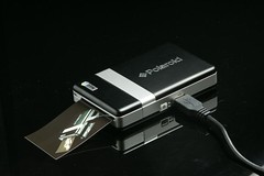
Every time I saw one of these tiny Polaroid PoGo printers in the shops I was reminded of David Du Chemin's book, Within The Frame. One of the things that he finds useful to break the ice when he wants to photograph people is to make a small print from a portable printer. I have no idea what printer David uses, but this little polaroid camera is now at the right price point to make it worth giving a try. Most retailers are now selling the printer for just under £30 and you can currently pick one up from Misco for £19.99.

This teeny tiny little printer is not much bigger than a pack of cards and spits out a 2x3" colour print in under a minute. The prints are dry to touch, water-resistant, tear-proof, smudge-proof, peel-off sticky backed. I persuaded my one to print a picture of itself printing a picture of itself, printing a picture of itself.. you get the picture. The print quality is not brilliant, the blacks are not quite deep enough and if you look closely there is some banding evident and they are a little soft, but these aren't supposed to be perfect, just convenient. Compared to the original consumer polaroids they are pretty good prints.

The instructions are pretty minimalist, but once you figure out how to load the paper, with the blue intelligent sheet at the bottom its pretty straight forward. On my Sony I set the usb mode to PTP and then connecting the camera and printer automatically loaded the pictbridge screens on my camera.

You can pickup 70 sheets of ZINK paper for just over a tenner which is actually not bad at all. There is no actual ink so its all pretty clean and self contained. I like it. I think my kids will like it too.

Saturday, 20 February 2010

You gotta fight for your right


Its bad enough that the stock agencies are devaluing photography and that thousands of amateurs are simply giving their photographs away for bragging rights or even that companies are blatantly stealing photographs and hoping that they won't get caught, but now the government wants to further devalue photography by making it much easier to take your photographs.

The Digital Economy Bill intends to make it legal for businesses to commercially exploit orphan works without paying proper compensation. Orphan works are works for which the original author cannot be found. The new bill proposes to set up a central body which will collect money from publishers for orphan works that they find and use. If the author discovers that their work is being used, they can claim a portion of the fee from the government body. It doesn't sound so bad in principle, but there is no provision against the creation of orphan works and the bill doesn't specify how hard you have to search for the author. There is also no indication in the bill as to how much compensation will be paid. This will all be decided after the bill becomes law by that pillar of the community Peter Mandleson who isn't at all slimy. This seems to me like a nice little scheme by the government to get a little extra revenue. Its good for the publishers because the government are unlikely to pay proper commercial fees so as to encourage publishers to pay up. Consequently the government becomes the nation's largest micro-stock agency and any image on the internet can have its identifying data removed and be bought at knock down prices

If that wasn't bad enough, the Information Commisioners Office is planning on making it illegal to take photographs in public if there is anyone who would object.

I'll be writing to my MP, if you want to find out more and to find out how to contact your MP follow this link to the copyright action website

Thursday, 18 February 2010

Irving Penn at the National Portrait Gallery


The National Portrait Gallery is showing an exhibition of over 120 Irving Penn portraits. The show opens today but you will need to book a slot. Head over to the National Portrait Gallery to book s slot

Friday, 12 February 2010

Photosmudger Workshop


The Hat


Last weekend, I arranged for London based editorial Photographer, Tom Miles, to deliver just one more of his excellent seminars from his tour of UK universities. I had been following the seminars on his blog and feeling extremely jealous of the workshy soap dodgers who were getting this amazing educational opportunity. So I contacted Tom and begged him to do one final workshop for the London Strobist meetup group. Tom agreed and arranged everything for us, even the venue. He used his contacts at Calumet in Drummond Street to let us use their room for the day.

Tom has an impressive list of clients (Men's Health, Men's Fitness, Runner's World, Golf Monthly, Penguin Books, Hodder Publishing, Maxim etc) he gave us a two hour talk, taking us through some of the images he shot for them, telling us everything about the shoot, from how he got the work through to how he lit the shots. He also gave us a rundown of how he got he got his start in the business and the work he had to put in to make it. One of the things which really stood out for me was the importance of assisting, not just for the technical experience that it gives you, but also for the valuable contacts you can make which will get you the work.

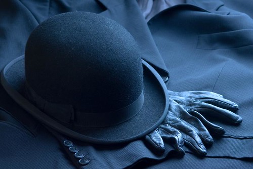
After Tom's talk we were given a choice of 5 assignments and three hours to bring back 4-10 images and an invoice. I have to admit that I let myself down with the assignment. I chickened out of asking strangers to pose for me and went for a subject that I could shoot as a still life. Now if you have ever met me, you might understand that people might be a little worried about being approached by me and I'm used to rejection. But thats no excuse for me not to try, I need to learn how to approach people and put them at their ease and the only way to learn how is to do it. The long and the short of it is, that instead of taking portraits, my forté, I ended up shooting still life, which quite frankly is not. I had these ideas that I would breeze through Camden market and grab some shots of bowler hats in the shops, get home and do some awesome still life shots and then romp back to Calumet and have my images reviewed to critical acclaim. It didn't quite work out that way. I did manage to get a couple of shots in the market on the way but nothing to write home about because I didn't take my time.

Then in my kitchenstudio I set up some lights and started to shoot macros of the details on my Bowler Hat. Unfortunately Bowler hats don't actually have a lot of details so I started getting a little desperate. The macros would probably have been acceptable, but as Tom pointed out during the critique, the focus wasn't quite in the right places to make the shots work. I should have used a little more depth of field and checked for critical focus. It would have been a good idea to shoot tethered so I could check the focus after each shot. He also suggested I go in much closer and show closeups of the stitching, so I had missed an opportunity to eak more details out of the hat. Of course I was starting to panic a little because the clock was running down. I got my wife to wear the hat for me and took a few natural light shots. Then I pulled out my tatty old suit and used it as a backdrop for the hat. This worked very nicely but it did take me a long time to get a framing and composition that I was happy with. This shot seemed to go down well during the critique but I was told that the set was a bit schizophrenic, they didn't look like they had all been taken by the same photographer. Perhaps if I had started with the wide shot I would have explored the detail of the hat from a better starting position and tied the images together with the same lighting style.

With the clock running down I loaded the images in lightroom, made a selection and started writing them to disk and while that was happening I started thinking about the invoice. I cheated a little because I used the model release forms from Tom's blog as a guide to the type of rights package and I knew from the talk that the fee would be in the hundreds rather than the thousands, I settled for a fee that turned out to be about half of what I should have been charging and stuck on some expenses such as my model's fee and the cost of the hat. I could probably have charged a studio hire fee as well as they weren't to know that I shot the whole thing in my kitchen. Unfortunately despite my lowball pricing Tom and Emma weren't actually going to pay me for my work, it was just an exercise. During the critique session after the assignment the invoice was given as much importance as the photos themselves and it was quite instructive seeing the different ways in which we all got it wrong.

I have to say that I was very impressed with the work turned out by my fellow strobists. Callum and Rams in particular turned out a superb product shot of shoes which they shot on top of Callum's car. And everyone put in a creditable effort considering that they had to persuade strangers to let them photograph them. You can see everyone's efforts in a Sldeshow on Flickr

Following on from the assignment critique, there were individual portfolio critiques by Tom and Emma an agent from Vue represents. I found the critique very encouraging and though my portfolio was quite focused, both Tom and Emma suggested the same images for weeding out and made suggestions for the type of images to build in.

It was a great day, not only did I get to go to an awesome seminar, but we raised over £300 for Tom's charity. I would highly recommend having a look at Tom's blog. It is full of great advice on the business of photography. If you are putting together a portfolio, you must look at Tom's series on portfolios.
Friday, 5 February 2010

Photography Inspirations: The World is the Human's Project


This is just a quick headsup to say that this book is currently on sale at the Book Warehouse on Southampton Row and I have also seen it in the new store on Camden High Street. I picked up my copy for £19 and its list price is £69.95. Whether you think its a bargain or not depends on your taste in photography. I would recommend that you head down to your nearest Discount Bookstore and see if they have a copy so you can decide for yourself. If you have weak arms take a friend, because this book weighs a ton. Its three inches thick, a foot square and has nearly 700 pages of photos.

There is a huge variety of images from a number of different photographers and yet the book manages to pull the whole lot together into a unified style. The majority of which are in a square format. There's relatively little text and a huge index at the back with the title and copyright holder. The only name I spotted that I recognised was Drew Gardener and a prolific photographer called Royalty Free. Of course there will be many from the book that I would like to get to know.

My five year old daughter, Christina, loves it. I haven't managed to get all the way through it yet, because she takes over. It really is a great book to immerse yourself in. But totally pants if you want to read it on the bus. I recommend putting it on the floor to read it as you won't cut off the circulation in your legs.