Every year in on New Years day, the streets of London fill with cheerleaders and brass bands. Its usually really cold quite often drizzling, but these young kids come all the way over here from the United states to freeze their tits off in the could grey light of a new years day in London, and some of them actually look happy about it.
If you don't have a hangover and want some photo opportunities, the new years parade will give you plenty. If you have got a hangover, watching lots of beautiful young people in the freezing cold might help cure it, though I suggest you get advice from your doctor first.
So charge up your batteries put on your fastest lens, take some alka-seltzer and head off to the parade route and maybe I'll see you there.
Check out my write-up of last year's parade for an idea of what to expect.
Friday, 26 December 2008
Friday, 19 December 2008
I Can Dance
Earlier this summer I was privileged to take photos at a special ballet class that my daughter attends on a Saturday. I was asked to photograph the children from all the classes with ages ranging from 3 to 19 years old, with all sorts of different abilities. The photos were put together into a slideshow that was played during the intervals of their annual performance.
I took their photos over three weekends during rehearsals. Spending that amount of time on one subject really helped me to refine my composition and figure out what worked and what didn't. Even though the room was relatively dark, I chose not to use any flash because I didn't want to distract the children and I didn't know if it would cause problems for some of them. So I was shooting at ISO 1000 f2.8 125/s most of the time.
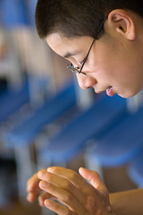
The location was a school hall with full length south facing windows on one wall and a row of east facing windows about two metres up on another wall. Shooting into this light created some really lovely highlights. The high windows in particular allowed me to get some cool backlight without getting into the shot. The biggest problem for me was that the walls of the room were very busy and distracting, getting a clean shot was a problem. I found that using a 135mm lens at f2.8 was blurring the backgrounds nicely. It would have been very easy to just go for tight headshots, to keep the backgrounds clean, but I also wanted to show a bit of the environment, so I started looking for shots where I could put kids in the foreground and background out of focus and have just the one child in focus. I think I cracked it with the Photo of Kimberly shown left.
I took some 3000 photos over the 3 days which I edited down to 300 for the DVD. I wasn't able to go along to the show, but the feedback I got was tremendous. One mother was telling me how her husband was in tears when the DVD was being played. I was a little overwhelmed by the response if the truth be told because I was looking at the images with a very critical eye. But when I watched the DVD again I started to see what the parents saw.
If I do this again next year, I think I would do some things differently. I would certainly take a more active role in managing the space. I wouldn't want to direct the kids, but I think I would make some suggestions about where the kids are located within the room and what direction they should be facing when they are performing so that I can get them in the best light.
One disappointment was that I didn't get great pictures of every child, I need to make sure I get at least a decent headshot of each child before moving on to the more tricky shots. There were certainly plenty of opportunities to do this.
I also want to shoot less and take more time over the design of the shots, be more pro-active and less reactive. The shot of Kimberly was done like this, I thought about how I wanted the shot composed and then I waited until Kimberly turned her head towards the camera.
As a direct result of doing this little project I have been recommended to the school by the parents to shot the school portraits. Apparently they haven't had a school photo in over two years. That's going to be a whole new kettle of fish. I have done a bit of research into photographing children with special needs doesn't lend itself to the sort of production-line flash lit school portraits you usually get. I'm excited at the prospect but also a little daunted.
You can see more of the ballet photos in my flickr gallery
Thursday, 11 December 2008
London Strobists Facebook Group
I have created a facebook group for London Strobists to complement the flickr group that has been successfully running meetups for the last year. Its not there to replace the flickr group but to provide another outlet and means of contacting members. We are running a rolling contest to design a logo for the London Strobists group. It has to be quintessentially London and it has to embody strobism. In the meantime I have come up with my own pop at the theme while we wait for someone to take up the baton.
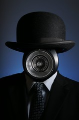
What could say London more than a bowler hat? Yeah baby! and What could say strobist more than... a strobe. It was a simple concept, all I wanted was a strobe between a bowler hat and a suit and tie so that the London City gent's face was replaced by a strobe. Tie it together with the colour blue in the background to represent the river and its there.
The difficult bit was doing it in my kitchen. I nearly gave up because I was getting so much light bouncing off the walls from the main light source, which was a large shoot through umbrella, that the background light was getting contaminated. But then the voice of David Hobby came echoing back to me "One step at a time.. One step at a time.. time..time..." So I turned off the main light and worked on the background light until it was how I wanted it. I used an SB28 flash with two layers of blue filter zoomed to 85mm. I had the power up pretty high so as to nuke the ambient light. I had the bowler hat sitting on top of my GY180 flashgun and it was silhouetted nicely with a halo of blue light all the way around. Next I worked on the main light, I got it as close as I possibly could to the subject, so that the power would be much higher near the hat than the wall. I also had to bring the subject as far from the wall as the room would allow
Once I had the hat and flash exposed nicely I stepped in and got my wife to take some pictures of me in a suit and tie, I would have used a tripod and remote for the entire shoot but my cooker was in the way. With the two shots in the bag it was a simple process of aligning them in two layers and rubbing out the unwanted portions of the picture. It was a quick and dirty comp for a small logo and didn't have to stand up to close scrutiny so there you go.
Wednesday, 26 November 2008
Ba Wang GY180 Flash
I have bought a new bit of kit, its a 180WS mains powered flash that I ordered from Hong Kong off of Ebay. I'm going to write a review of it, but before I do I would like to explain a bit about the background of this purchasing decision. Scroll down if you want to skip straight to the review.
I first got into artificial light when I joined The Camera Club in Kennington. Its a great little place, two well kitted out studios with Bowens flashguns, and a gallery space. I took a couple of lighting classes and then having learnt a little a rented the studio for a few solo sessions with some models I met off the internet. I was well and truly hooked, but the fact was, cheap as the studio was I couldn't afford to shoot very often even at £8 per hour. I wanted to get my own set of studio lights, but they were far too expensive for me to have my own set. So I headed down the Strobist route and bought a bunch of small flash guns and started shooting on location. It was liberating I could take them pretty much everywhere I went and wasn't tied to the mains. I missed the modelling lights and I missed the power, but not as much as I though I would.
Fast forward to today, and I have been trying to do these tight snooted shots in a very dark space. This has given me two problems. One is that aiming the snoot accurately is difficult even when I have used an assistant. The second problem is that I didn't have enough light to focus accurately. So I have been thinking again that having studio flash would be quite handy. I also would like to try some lighting techniques using the modelling light that you can't do with strobes.
Jessops have been selling some low powered 180WS flashguns under the portaflash brand for some time. I'd always been a bit dismissive of these because of the low power. After all 180WS is not really much more powerful than a speedlight, having learnt the strobist way, I am now far more comfortable with low powered flashes and so these small mains powered flashes were starting to look a lot more desirable. You can get a two light kit from Jessops that represents reasonable value for money, but being a cheapskate I found someone on ebay selling the BA Wang GY180 Flash Light with a 60x60cm softbox for £51 including delivery, which was a hell of a lot cheaper than buying from Jessops. In fact a portaflash on its own is nearly double that. So temptation became a purchase and just a few short days later I had a new flash.
The flash and softbox arrived in two packages delivered by DHL and were adequately packed. Inside the box with the flash was a fair length power lead, a long sync lead and a bulb for the modelling light. The softbox consists of a huge speedring, a inner and outer diffuser a black outer cover and four spokes.
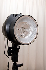
The flashgun looks quite neat all in black. It has a hinged foot for attaching securely to a light stand. It has an umbrella holder built in at the base of the flash. The controls at the back are pretty easy to figure out. There is a power switch, a switch to turn the modelling light on, and a potentiometer (knob) to allow stepless power adjustment from full power down to 1/8th power. A flash ready light and a test button. Synchronisation can be achieved either using the built in slave or using the sync port which is rather sensibly a 3.5mm jack socket. The bulb for the modelling light extends rather alarmingly beyond the edge of the built in reflector, which means that it has to be removed for storage. This I feel is a bit of a design fault because these bulbs get very hot and don't take kindly to being touched with greasy fingers. It also means that the modelling light is going to throw light wider than the flash tube so what you see is not what you are going to get. The flash is missing features that you get in more expensive strobes, such as adjustable modelling power and a flash ready beep but for the price you pay for it you are going to expect it to be cheap and cheerful. The strobe casing doesn't have any mount points for light modifiers. Its completely smooth which did make me wonder how you were supposed to attach things to it.
I did some tests of the output from the flash and I was a little surprised to say the least. I knew that it was difficult to directly compare this sort of flash with a speedlight, but I wasn't expecting the output I was seeing. I set up the flash a reasonable working distance away from a light meter, about 5.5 feet and triggered it in the dark. It gave me a meter reading of f9.0 at full power. I set up an SB28 at the same distance zoomed to 85mm and took a reading of f20. That ,second hand SB28 speedlight, kicks out over two stops more light than the mains powered flash, you would need 4 GY180s to give the same light level as an SB28. Ok, so thats not a fair comparison as the mains flash has a wider beam than an SB28 at full beam. So I set the SB28 to 24mm and got a reading of f18 thats still two stops more than the GY180. However, once I had attached the softbox, with the inner diffusion panel, boht the GY1800 and the SB28 (at 24mm) were throwing out the same output. So you don't want to go getting one of these flashes if you want more power, unless you are always going to use an umbrella or a softbox. If you want to use a snoot or a small grid you are simply going to lose too much power. To me this flash seems so underpowered that I would question the claims of a guide number of 48, though they don't specify whether the guide number is in feet or metres and the measured output is closer to 48 in feet than 48 in Metres
As I mentioned before, the softbox comes with an enormous speedring, which was too large to fit on the front of the strobe. It actually had to be fitted around the main body of the strobe and didn't feel very secure. There were no instructions with the softbox and I'll admit being a bit puzzled at first as its not very intuitive. To put the softbox together you need to put the four spokes into holes in the speedring, Then the front diffuser has pockets on each corner to fit the ends of the spokes in. But to fit the spokes into the holes you need to bend them. It wasn't easy to do and I was worried that I was going to damage the spokes. Next take the black cover and attach the inner diffuser to the velcro tabs. Then fit the cover over the speedring and spokes and it velcros together with the edge of the front diffuser. Attaching the speedring to the strobe with the softbox fully assembled is tricky, but I can't see any other way of doing it. The flash slave didn't work with the softbox on, so triggering via the cable or a radio slave would be desirable.
Overall for £51 including postage for the flash and softbox its dirt cheap but if you don't need a modelling light, a speedlight is way more versatile and powerful. You also need to consider a few other things. Because of the modelling light, you can't put your own cardboard and plastic light modifiers on it because they could catch fire or melt, so you are going to have to spend money on decent modifiers, or figure a way of constructing modifiers from heat resistant materials. You are tied to the mains with this flash and its not as compact as a flashgun, so its going to be ok for a home studio, but not so good on location. Once you start putting modifiers on it the power is going to drop drastically. Would I buy another? I don't know, I think its going to been fun to use in my kitchen for tabletop work. I'm going to have to put it through its paces in a real shoot to see how useful its going to be but considering the low power I cant imagine using it with a snoot as I originally intended.
Monday, 24 November 2008
Making a Christmas Card
Last year I created one of the most popular photos on my Flickr stream. It was a simple photo of a wine glass with a christmas tree behind it. I adapted a lighting technique called dark field lighting from the excellent book Light: Science and Magic. The technique involves creating large light sources outside the frame of the shot to create specular highlights at the edges of the glass.
The head of my company liked the image and asked if I could create something similar, but somehow work in some aspect of the company into the shot. After a lot of procrastination on my part, the finance director put together a team to work on the shot and I found myself with two assistants Alix and Paul. Together we pre-visualised the shot we wanted and Alix and Paul arranged to bring in the props. We had decided to use a very similar shot to the original, with the wineglass and a tree in the background, but we would work in the company colours with Christmas tree decorations and a small pile of gifts.
The key to lighting the glass was to have two large white light sources just outside of the frame. This would create specular highlights at the edges of the glass to give it definition. You can do this very carefully to achieve a subtle effect, but I didn't think subtlety was necessary in this instance and was happy to have large highlights. My assistants set up the tree in a corner of a meeting room and dressed it. While I set up two SB28 flashguns on 1/32 power 24mm zoom pointed at the walls. The low power was used because the aperture was going to be wide open at f2.8. The light from the flash bouncing around the room mixed with a small amount of ambient was enough to get a good exposure.
Most of the time spent on the project went into dressing the set, the lighting setup was pretty quick. We could have spent the whole day arranging baubles, faerie lights and bits of Holly, but ultimately we had to compromise because we only had a very short time to do it in.
In post processing I did a bit of cloning around the printed label and wine glass and adjusted the exposure to suit our finance director's taste and overall we were all pretty pleased with it. I would have liked to have done a bit more styling on the tree and perhaps used some different wrapping paper but we had to stop somewhere. I regretted leaving my gels and tripod at home, but I don't think it made a big difference to the final image.
Tuesday, 11 November 2008
Auto Exposure Lock
Most DLSRs have an AEL button and if you use it at all, chances are that you probably use it lock the auto exposure, so that it uses the same exposure values from shot to shot even if the scene changes. So for instance you are shooting a parade and you have a good exposure, then a bunch of cheerleeders show up all dressed in black and the camera wants to turn them 18% grey. But having locked the exposure, they will be properly exposed.
If your camera allows it, there is another thing you can do when you have locked the exposure. You may be able to use your control wheels to change the aperture or shutter speed. With the exposure locked any change in aperture will cause a corresponding change in shutter speed so that the overall exposure stays the same. So imagine you are working with flash, you could expose for the ambient using your fancy multi-segment matrix metering with the flash switched off. Then, with the ambient exposure sorted hit the AEL button and turn on the flash. You can now adjust the power of the flash using the aperture wheel without changing the ambient exposure. Neat?
If like me, you can never remember your f-stop tables, the AEL button can tell you. Put the camera in manual mode, set your shutter to something you can multiply or divide by two then hit the AEL button. If you halve the shutter speed the aperture will close down one full stop. If you double the shutter speed the aperture will open up one full stop.
Monday, 10 November 2008
Free Shows at the National Portrait Gallery
This is possibly the best time ever to visit the national portrait gallery. Not only is the great Annie Leibovitz show still running, including four free to view prints of the Queen, but there are also two free exhibitions on at the moment.
The Headline exhibition is the Taylor Wessing portrait prize. The entrance to the exhibition is dominated by the second prize winning "Bag" by Hendrik Kerstens. The print has got to be about 6 feet tall and is a simple portrait of a beautiful young woman wearing a plastic bag on her head. It almost looks like a Vermeer and is incredibly detailed. The light is absolutely beautiful, her skin is made to look pale and luminous without appearing blown out. Strobists will certainly have some fun working out how the look was achieved. There are lots of really lovely portraits its well worth a visit.
The other smaller exhibition is Champions by Anderson and Low. These are a series of portraits by Anderson and Low of sportsmen and women in black and white and in the nude. It was remeniscent of Annie Leibovitz's Olympic portraits only lighter and much more polished, Annies portraits tended to be a bit on the raw side. Some of the headshots tended to be a bit too formulaic for my taste but the there were some with fantastic angles and compositions and the figure studies were simply great.
Head down there while its all going on and don't forget to drop some money in the cashbox while you are down there.
Tuesday, 4 November 2008
Annie Leibovitz At Work
I couldn't resist it, I was at the National Portrait Gallery exploring Annie Leibovitz's exhibition and there was a copy of her book for sale, discounted by five pounds. Thats all I needed to know, five pounds off, I could claim to the wife that I had saved five pounds.
Please don't tell my wife that you can get it with £8.50 off at Amazon with free delivery
The book takes you on a journey from the time she was travelling with her parents through to pretty much the present day and explains the background to the photos that she took throughout her career. At the end of the book there are two chapters on equipment and the ten most frequently asked questions.
Don't expect too much detailed technical information, what this book is really about is the insight into Annie, the way she works and the wealth of photographic history that she carries with her to every shoot. If you have watched the recent documentary about her life you are likely to get a strong sense of deja vu reading this book, but it is a good read all the same.
My one complaint about the book is that there pictures are quite small. Considering that the retail price is £25 I would have liked to have seen bigger prints. But I did have a chance to flick though it before I bought it so I shouldn't really complain.
The exhibition itself is absolutely packed with photos, some of them very well known and many others very personal. Well worth a visit if you are about in London. And let not forget the discount you can get on her books.
Thursday, 30 October 2008
Ideal Flash for the UK strobist?
The days of being able to get a Nikon SB28 flash for £45 are gone, and I have never seen an SB26 for sale on ebay. So I have been searching for viable alternatives and I believed that I had found the almost perfect strobist flashgun here in the UK, unfortunately it falls just short of the mark.
Its the Jessops AF360D, currently on sale for £99 with a 25% discount on top of that, if you order online and use a voucher code. Try googling for the voucher codes as they may change over time. £75 for a brand new flashgun isn't too shabby, and so dear readers, in order to help you out, I thought I would buy one and road test it for you.
The Flash is very similar in size and shape to the Nikon SB28, the flash head itself is a little longer. The head tilts and can swivel to face backwards. It has several zoom levels 24,28,35,50,70,85 and power can be set manually in 5 full stop increments from full power down to 1/16th. The guide no is 36 and it has an optical slave. It will work as a TTL flash if you have a compatible camera. The head also sports a built in bounce card and wideangle diffuser. Recycle time is a touch on the slow side at aproximately 4-5 seconds at full power, but once you drop to 1/2 or 1/4 it becomes acceptable. One feature that really excited me was the beep indicator. The documentation appeared to suggest that with the beep indicator on, the flash would beep when ready. But sadly that wasn't to be the case.
The build quality seems a little less solid than an SB28 and the zoom motor is very noisy and vibrates rather distressingly as though its about to strip its gears. In fact at one point the zoom motor went doo-lally and I had to turn the flash off to get it to shut up. All the controls are very easy and intuitive to use. I particularly liked the cheap slider switches for power and slave mode. However the build quality really does let this flash down. The flash foot on mine had a centre pin that was a little too short, and it wouldn't fire when attached to my minolta shoe adaptor or my sonia hotshoe. Eventually I attached it to a Kaiser hotshoe and it was able to fire. However there was a further problem, because none of the controls would work when attached to the hot shoe. I managed to get it working in the end by putting some gaffer tape over all the contacts except for the centre pin. I returned the flash to Jessops to see if it was a fault with my one, but it seems that its a design flaw. Presumably the tolerances were designed for the Nikon shoe, and not for third party shoes. This makes it a little tricky to use as there is no PC port.
The other disappointment for me was that with the beep indicator illuminated, there was no beep. It doesn't appear to do anything at all. All the button with the loudspeaker Icon seems to do is make the icon light up on the screen. When I tried it with a replacement flashgun, that didn't work either. So I can only assume its a feature that has been disabled or not available in manual mode. This was a pretty big disappointment to me because I was far more excited by the beep indicator than a grown man should ever be
Compared to the Nikon SB28 you are missing out on 1/3 stop intervals and 1/64 manual power or PC socket. But you gain a built in slave flash. I tested the slave flash, and it syncs at up to 1/1000s and possible faster. An unwelcome feature is the power saving function which activates after 3 minutes. This may become a nuisance.
If the beep indicator and the hot shoe had worked properly I would consider replacing some of my other flashguns. Certainly my old SB24's days are numbered. However given the build quality I wouldn't want to rely on a bag full of them for an important shoot. You can currently get an SB28 for around £69 on ebay, so the store price for the Jessops flash is possibly a bit high and given the build quality, I might even consider the heavily discounted £75 a little too steep.
If I had to choose between the Jessops 360AFD and a second hand SB28 or SB26, Nikon would win. But despite the problems with the hotshoe I would probably choose it over a Sunpak 383 or a Vivitar. If you really want to get a cheap flash fast, take your hotshoe and triggers to Jessops and try one out.
Monday, 27 October 2008
Do you see what I see?
I'd seen it mentioned a couple of times that our vision is horizontal rather than vertical. It was only when I read Annie Leibovitz saying that she found portrait format awkward because she sees horizontally that I realised that I don't really see that way at all. As I looked up from the book I realised that I actually frame the world in a portrait format. This might explain why I so frequently turn the camera on its side to take pictures. Its more natural to me. Am I a freak? Or is it just the way that I have learnt to see the world.
The eye doesn't see the world in an instant like a camera, because of the way the eye is constructed, we actually scan the world that we see and the brain builds a picture. At the back of your eye is your retina, the sensor that detects light. The density of the photoreceptors in the retina is not uniform like a camera sensor it is at its highest density at a tiny point called the fovea and rapidy drops. Just 4mm from the center of the fovea the density is just 5% of the density at the centre of the fovea. Try concentrating on a single letter in this article and try not to move your eyes, then without moving your eyes try and become concious of the words surrounding that letter. How much of it is sharp? Very little right? Your fovea only covers 2 degrees of your 180 degree field of view so most of your vision is blurred.
So if your vision is mostly a blur how do you actually see things? The eye scans the scene building up a picture and the brain fills in the gaps. There is enough detail outside the area of the fovea for you to notice contrast and the eye quickly flicks from point to point checking for things of interest. Some scientists and artists can predict the movement of your eye over an image.
I think the reason that I see the world in portait format is because I walk a lot. So I have a tendency to scan up and down to avoid obstacles in front of me rather than side to side. This may well explain why landscape format pictures don't come as easy to me as portrait. So many aspects of photography are about seeing the world in a different way and training the eye to see the things our minds gloss over like shadows, reflections and light, that I think it would be a good idea for me to train myself to start seeing in landscape format instead of portrait.
Further reading
Photoreceptors
The Photographers Guide to the Eye
Wednesday, 22 October 2008
Christina's Story
A while ago Gary Cosby over on his A little news blog had some news about his son Reece, who was diagnosed with Down Syndrome at one year old. It got me thinking about when my daughter was born and how inspired I was by the story of Victoria, the daughter of Photographer Maria de Fatima Campos. Victoria's story made me realise that my daughter Christina having Down Syndrome, wasn't something to fear and that I should just enjoy having her in my life.
Christina's start in life was entertaining to say the least. At her first scan we were told that the measurement of her nuchal fold was on the high side of normal, there was a chance that she might have a chromosomal abnormality. They tried to get us to take all sort of tests including amniocentesis which carried a greater risk of miscarriage than there was of her having Down Syndrome. We told them that we didn't need any tests because we would keep the child, even if it had two heads and we weren't going to risk a miscarriage or a false positive test if it wasn't going to help in any way.
So the pregnancy continued and at the next scan Christina was moving around so much that they couldn't find her heart to test it. A state of constant motion seems to be a feature of her life. So we were booked in for another scan a few weeks later when hopefully she would be bigger and not be able to move around so much. This time they had discovered a problem. The reason she was so mobile was because Karen had excess amniotic fluid and after several scans they found the reason. Christina had duodenal artesia or double bubble as the doctors liked to call it. Her stomach was blocked which meant she wasn't able to regulate the amniotic fluid, she would need an operation as soon as she was born.
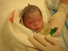
After this news, maternity leave started early. Karen had to take it easy because with all that extra fluid there was a chance of a premature birth and haemoraging. Sure enough, two months early, Karen's waters broke and we had to get a taxi to the hospital. After the waters had broken, there was a risk of infection. Not only that, but Christina could also squash her umbilical cord and cut off her blood supply. Christina's inability to sit still came into play and all through the night she was on and off that umbilical cord. Eventually the doctors decided perform a caesarian, so I scrubbed up and sat by Karen's head while a nice man sliced her open and brought our baby into the world.
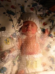
After a very brief visit with her mum, Christina was put in an incubator and rushed to Great Ormond Street Hospital (GOSH) where she would get a scar to match her mother's. They reconnected her plumbing, straightened out some of the shoddy workmanship and removed her appendix. They put a blanket of bubblewrap on her and released her back to the ward. The next couple of weeks were spent travelling between home, to take care of my eldest daughter, The Royal Free hospital where Karen was and GOSH where I was allowed to spend the night in a family room. As you can imagine, I took hundreds of pictures.
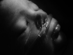
Christina wasn't able to eat, so she was getting nutrition from a drip and her constant movement kept tearing the drip out. Every time she pulled the drip out, they had to find another place to put one. At one point the drip in her foot burnt her and she had to have the plastic surgeon irrigate her foot with a big syringe, she still has lots of tiny pinprick scars from that. After about the third week she was able to start feeding on expressed milk from a syringe and soon after that we got to take her home.
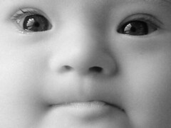
She was tiny. I practically had to set the camera to macro mode to get a full frame headshot. For the first six weeks that we had her home she wasn't putting on weight, she was just getting skinnier and skinnier. We managed to see someone at GOSH who told us supplement her breast milk with formula and she finally started to gain some weight. Not long after she got home, the press came knocking. She had her story and pictures in Junior: Pregnancy and Baby Magazine, Woman's Own, and The Sun (Though not on page three I hasten to add)
Ok, so I have written loads already and she has only just reached home, I'll pick up the pace.
There was a lot to do when she arrived, loads of doctor's appointments, physiotherapy, speech and language therapy, hearing tests, thyroid tests etc. We all learnt Makaton sign language to help her express herself. There was a lot of hard work to do, mostly by her mum while I've been out at work. Her big sister Caitlin has been an enormous help too and they get on like a house on fire.
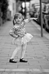
She has been full of surprises. While her spoken language was behind her peers she had a much higher vocabulary than them if you included the signs she knew. She didn't learn to walk until after she was two years old, but she was able to recognise her colours and letters before her peers. She even astounded me by being able to read words like pig and cat from a very early age. She is four years old now and going to school. At weekends she takes ballet class and she is simply adorable. I couldn't ask for a more loving child than her and I can't imagine life without her.
The following organisations have been invaluable in helping us with Christina:
Cerebra Cerebra is a unique charity set up to help improve the lives of children with brain related conditions through researching, educating and directly supporting children and their carers. (Donate)
Great Ormond Street Hospital Great Ormond Street is the only exclusively specialist children's hospital in the UK (Donate)
Kids London Kids London provided us with home learning (portage) (Donate)
Elfrida Rathbone Elfrida Rathbone Camden is a charity which provides a range of free services to people with learning difficulties, disabilities and families under stress.
Down syndrome association The Down Syndrome Association is focussed on helping people with Down Syndrome live successful lives. (Donate)
Down Syndrome Education International Through research this organisation develops educational materials that best meet the needs of people with down syndrome.(Donate)
DS UK Mailing list This is a mailing list for parents of children with DownSyndrome in the UK
Downright Excellent This is a local group that provide education and therapies for young children with Down Syndrome (Donate)
Wednesday, 15 October 2008
The Photographer's Eye
I got some Amazon vouchers from my mother in law for my birthday, so I decided to give "The Photographer's Eye" by Michael Freeman a go. Michael Freeman is a travel and reportage photographer who has worked a great deal in Asia and is also a prolific publisher of photography books, with over a hundred titles to his name. The subtitle of this book is "Composition and Design for better digital photos" and I will admit that the inclusion of "digital photos" in that subtitle put me off a little, as it sounded like the book was jumping on the bandwagon, but in fact there wasn't much in the book that wasn't applicable to film photography as well as digital.
The book is very comprehensive covering just about everything that I have heard of and then some. This is an order of magnitude more than the usual advice you'll get on the web. Each section was well balanced with very useful illustrations. Some of the best sections showed alternate examples of the same scene to show not only how different design decisions affect the final composition, but also to give an insight into the photographer's decision making process.
There is a fair amount of emphasis given to the way the eye moves around the picture and what subjects and graphic elements transport or attract the eye. The aim being to first attract the eye to the image and then keep it moving around the image for longer. In some cases it is useful to create a strong attractor to stop the eye from being distracted by a cluttered scene. None of it is meant to be followed slavishly, its about having a repertoire of things that work, that you can draw upon or avoid.
Some might criticise that the photographic examples aren't outstanding, but the photos have been chosen to illustrate the ideas in the book and have been kept simple for that purpose.
All in all this is pretty good stuff, already its making a difference to how I think about images that I take and see. Its easy reading style is a lot more accessible than some more dry academic books, which means I'll read it more than once when I feel the need to refresh. Highly recommended.
Friday, 10 October 2008
Strobist at Maplins
Update: I have bough the one with the flexible arm and it looks like it might not be stiff enough to cope with a flash head. I will do some experimenting when I get home with it
I popped into Maplin's today to see if they had anything handy. I wasn't looking for anything specific, you know, but they have stuff and maybe some of it would be handy for something? You know what I mean? I was quite surprised to find that they are selling some photographic accessories that might be handy for a strobist and at a reasonable price too.
Click on the images to visit the Maplins website.
I popped into Maplin's today to see if they had anything handy. I wasn't looking for anything specific, you know, but they have stuff and maybe some of it would be handy for something? You know what I mean? I was quite surprised to find that they are selling some photographic accessories that might be handy for a strobist and at a reasonable price too.
The first item that I saw was a large photography clamp for £9.99 which had a ball and socket head on it. Its designed to support a compact camera so it would probably be fine for a flashgun. The clamp is a little on the large side, at least as big as a bogen superclamp, but not as secure.
They also sell a clamp with a gooseneck and ball socket which looks like it could be very handy for tight spaces. Its the same price as the regular clamp so seems like good value. The bendy neck is about a foot long.
The final little gadget they sell is a suction clamp to be honest it looks a little on the flimsy side but if it can hold a compact camera without falling it will probably hold a flashgun. But I wouldn't want to put a DSLR on it.
Click on the images to visit the Maplins website.
Wednesday, 8 October 2008
What's on in London
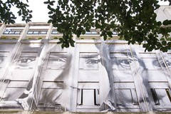
This is a quick heads-up on a couple of things going on in London at the moment. Today I had a wander down to the Charing Cross Road and I got a feeling I was being watched. The buildings on Mannette Street had been covered with enormous building sized prints by the French Photographer JR. It was causing quite a stir. The nearby Lazarides Gallery was covered from floor to ceiling with A3 blowups of the contacts and a rather powerful video, go take a look. All the portraits are shot in black and white with a 28mm lens closeup. There is a website which is worth fighting through the horrid navigation for. www.28millimetres.com Check out the photos from Brazil
For some more conventional portraits, the National Theatre has an exhibition of portraits by Simon Annand, of actors and actresses doing what they do in the 30 minutes before the curtain goes up. Its a charming collection and well worh seeing before its taken down on the 9th November.
Meanwhile over at the National Portrait Gallery, they are preparing to show Annie Liebovitz's life from 1990 to 2005. The show starts on the 16th October. Then on the 6th November they will be showing the Taylor Wessing Photographic Portrait Prize.
Sunday, 28 September 2008
Hard Light
Its been a very busy month for me. My day job has been turning into my night job and so I haven't had time to post anything on the blog. But seeing as I did manage to find time to organise a mini strobist meet at my secret location, I thought I might as well write about it.
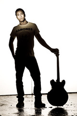
I had arranged to have 3 models and three photographers meet me for a shoot a couple of weeks ago. Two of the models cancelled at the last minute, but fortunately Wade, pictured here, showed up and it actually worked quite well. Each photographer prepared a set, and Wade was able to move quickly from one to the other without having to hang around for test shots and set-up.
For this shot I wanted a full body silhouette with just the face picked out with hard light from a snooted flashgun. I don't have any seamless paper so I used a couple of 6x4 polystyrene boards and threw a bucket of water over the floor. I lit the background with an SB28 flash on full power, and used barn doors to control the spill because I didn't want any light hitting Wade. I deployed a voice activated light stand called Huy to light Wade's face with another SB28 this time using a small coroplast grid.
This kind of shot has a lot of challenges. First of all I needed to get Wade far enough away from the background to avoid light wrapping round him but the background is quite small, so I had to stand well back with a 135mm lens to get him and the background in the shot. This led to my second challenge, which was focussing. The location is a derelict underground car park, with no windows and only a few working flourescent lights. This is when I really started to miss the modelling lights on studio flash. Huy was able to get some light onto Wade's face with a head mounted flashlight but the autofocus really struggled to lock on. Very few images were sharp enough. Another issue was that my voice activated lightstand also had some trouble getting the flash pointed in the right direction. It took quite a few shots to get to this one. The light isn't quite falling exactly where I had wanted it. If I were to do this again I would get the subject to wear a dark shirt and use a tighter grid, but I think the highlighting of the Ramones T-Shirt works in this context so I'm not unhappy with it.
It was a good day, everyone came home with some great shots and we had some fun. If you are based in London and want to do this sort of thing then join the London Strobist Flickr group and come to a meet. If you want to see more Here are some more images from the day
Friday, 12 September 2008
Last Chance to See
Tommorow is the last weekend that the Photographers Gallery will be running the excellent Fashion in the Mirror Exhibition I blogged about earlier get down there tommorow if you have some free time. The last day is the 18th September.
Thursday, 28 August 2008
Biggest news of the year
No this really isn't another Nikon D90 post, I mean it is quite exciting news and all, if I had the cash I would jump ship to Nikon immediately, but I guess I will have to wait until Sony bring out their video enabled DSLR, it won't be long before everyone has one.
Anyway now that I have your attention, I though I would tell you about the news, that is more exciting to me than anything else. Joe McNally is writing his sequel to The Moment it Clicks. Its available for pre-order on amazon and will be shipping in Janary.
I had sat on this news and emailed Joe, hoping that he would tell me what the book would be about. He did in a way, as soon as he got back from china he posted a huge teaser on his blog.
The new book looks like its going to be a cracker, and its going to be about small camera flash, so it will provide a fix for you Xenon addicted photographers. Go read about it from the horse's mouth and pre-order your copy.
Friday, 22 August 2008
Kaiser Hot Shoe Mod for Skyports or Pocket Wizards
This is a remix of a set I did on flickr a little while back to document a project to modify my kaiser hot shoe mounts for use with my Elinchrom Skyports but you could also use this for pocket wizards.
I hate using the PC connectors on my Flashgun because they often fall out. Also the little cables for the Skyport to a PC socket cost an arm and a leg. So I decided to modify some hot shoe adaptors I already owned. They cost less than the pocket wizard cables that you would need to connect up with, and its a more secure connection. Also I'd rather modify the shoe adaptor than the flashgun.
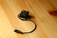
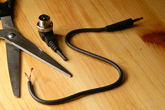
This little feller is quite useful, It has a PC connector on a cable and a tripod socket on the bottom. Its quite handy for mounting securely on brolly holders, but when I used it with my Elinchrom Skyports I used to leave the wire dangling free. Replacing the PC plug with as 3.5 mm phono jack would allow me to plug it straight into the skyport.
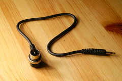
This funky but useless cable came with the skyport. Its useless for me, but the phono plug that goes into the skyport is useful so I'm having that.
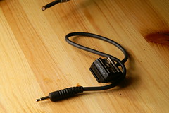
Take that useless cable, cut off the coax connector and keep that nice cable with the phono connector.
Flickr member Paul Chilly wrote in to say that you should cut the donor cable just above the strain relief, that way when complete, you can push the strain relief against the hot shoe, creating an even more professional result!
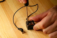
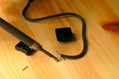
The Kaiser Hot Shoe thingy has 3 screws that you undo to take it apart. You need a teeny screwdriver. This picture shows you how to unscrew one screw, you work out how to do the other three.
If you are completely inept, you might want to put the screws into a jar so you don't lose them. I'm just saying...
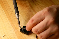
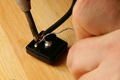
You are going to have to carefully remove the old wire. Its a good idea to pull out the central contact or you could melt the plastic. Just get your soldering iron nice and hot, Hold it over the places where the wires connect and gently pull apart.
This will take a little dexterity. Get an grown-up to help you.
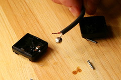
Ok so you have thrown away the old wire, now get the new one and solder it back in the position that the old ones was in. Don't stress about which wire goes where it doesn't really matter. Just make sure you get a good solder joint; that cable may have to take some strain.
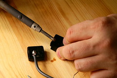
Ok so you've soldered the central contact onto the wire and burned a couple of circles in the table. Whoops!
Wait for it to cool down and fit it back in the plastic case. It will make it easier to solder the other wire.
Tell your partner the circles are knot holes...
Wait for it to cool down and fit it back in the plastic case. It will make it easier to solder the other wire.
Tell your partner the circles are knot holes...
With one hand hold the solder, with the other hold the case and with your third hand hold the soldering iron. Fortunately I have 4 hands so I could use the camera as well, but you may want to get a consenting adult to help you.
Be very careful, with the second wire, you don't want to melt anything and you don't want any short circuits, but you do need a good strong joint.
The cable might be too big for the hole, So carefuly melt it with the shaft of the soldering iron so that the hole gets bigger. No! not like that you idiot! I said the shaft, you don't want to get blobs of solder mixed in with the plastic.
You may find that melting the holes may make the case difficult to close, so you might need to scrape some of the excess plastic away from the inside edges with scissors or a sharp knife.
Now screw everything back together and you are done. One thing to watch out for is not to try and force the case closed as you could damage it. If you have difficulty closing it, then you should make sure that there are no protruding bits of plastic or insulation in the way.
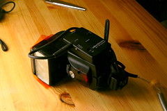
Here it is on the flashgun. The skyport is attached to the side with velcro, The foot of the flash now has that handy hole and it all connects nicely and very securely together. Its like a marriage made in heaven or in this case; North London.
Thursday, 21 August 2008
No Shit
If you live or work London, you may be aware of The Photographer's Gallery in Great Newport street. Walking in there can be a bit random, sometimes you'll see beautiful photos of shit, and on occasion shit photos. The last exhibition or two haven't been to my taste at all, but I popped in this Luchtime and both galleries had some really interesting photos.
There are two exhibitions on. In number 5 there is an exhibition of Danny Treacy's work: Them. This has been fairly well publicised in the photography magazines and is well worth having a look at. Danny has scoured the land looking for discarded clothing and then re-fashioned them into outfits and photographed them on himself. The pictures in the magazines and on the net don't do them justice. In the gallery the prints are larger then life size and look pretty damn good.
After you have looked at "Them" and maybe had a tea and a cake in the gallery tuck shop, you might want to wander into number 8 and have a look at the exhibition: Fashion in the Mirror: This is a fairly broad collection of photographs from fashion photographers with luminaries like Avedon, Helmut Newton, Mario Testino and Steven Meisel. The Meisel work is layed out in a box down the centre of the gallery with the spread open pages of the magazine they were commisioned for, but there are also many fine prints on the walls. I was particularly pleased to see one of Harry Peccinoti's prints up large on the wall.
The exhibitions are only on until September the 14th so run down there now and take a look. You won't regret it. (Click on the images for more info)
Wednesday, 20 August 2008
Barn Door Update and A Shooting
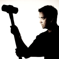
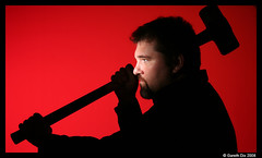
Last weekend I met up with fellow strobist, Gareth Dix, aka Cham128, at an undisclosed location to practice a bit of strobing. We didn't find Dick Cheney so we had to photograph each other. My model was okay but I didn't think much of his.
We were inspired by Nigel Parry's work to do some pretty hard contrast shots which required a lot of control of the light. I had brought my DIY barndoors and Gareth brought along the same brand of barn doors that were reviewed by David Hobby a while back. I was quite interested to see the difference between my ebay bought doors and Gareth's.
The first thing I noticed was that Gareth's was much smaller (his barn doors). In fact they weren't really much bigger than my DIY barn doors. The only problem was that they wouldn't fit on my SB28s. Maybe if they weren't covered in velcro they might have fitted, but we had to give up on them in the end. Secondly they were a lot less fiddly than the DIY barn doors. Fitted on Gareth's flash there was no problem using them with coloured gels, but the DIY barn doors were difficult to use with gels. I had to add velcro to the gels so I could stick the doors on. It wasn't elegant but it worked.
So provided that they fit your flash and you don't mind a little extra bulk, they aren't bad at all. But I guess where it starts to stack up is when you want a set for each flashgun. Thats where the DIY barn doors have an advantage, because you can split the doors across multiple flashes and they are physically smaller. I guess you could carry both in your bag.
The reason we needed the barn doors was to stop any spill from the background lights from contaminating the silhouette of the subject. What we were doing was lighting a 6x4 sheet of white polystyrene with two flash guns, using the barn doors to kill the spill. The subject in the foreground was lit with tight grid aimed to just light the face and nothing else. After we had tried some white background shots we put a red gel on the background light ( we only had one gel ) and got some iconic soviet style images. Finally we cleaned the dismembered corpses out of a wire cage and placed the cage between the background and the background flash to throw some dramatic shadows on the polystyrene. It was a good day.
Saturday, 9 August 2008
How to make barn doors
If you saw my barn door review last week, you will have seen that I was uncomfortable with the size of the rig. If you are going to carry around something fragile and flimsy, why not make it portable and do double duty.
Given that my flash is covered in velcro for attaching gels, I thought it would be possible to create barn doors that can be attached directly to the flash. All I needed was a hinge mechanism that would allow the doors to be set in different positions.
I realised that it would be possible to create the barn doors using some stiff card for the door and cinefoil as a hinge. Cinefoil is heavy duty black aluminium foil use on film sets to make light modifiers, I had some handy, but you might be able to use stiff silver aluminium foil.
The neat thing about this design is that the DIY barn doors are stored flat, take up very little room in your bag and they don't all have to be attached to the one flash, so you could split them between two or more flashguns if you want to use them as flags.
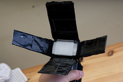
The final result doesn't look too shabby and the individual doors can be removed if required. Because the doors aren't as wide as my ebay barn doors there isn't quite as much scope for producing a thin beam of light, but I quite like the light pattern it produces compared to the ebay doors and of course it is way cheaper and more portable than the ebay doors. It would be no hardship to keep a set in my camera bag. I think there is more tinkering that can be done with these. It might be possible to refine the shape of the doors to create wider beams or a double hinge to allow the doors to unfold to the same dimensions as the ebay doors. With something this cheap and easy to make, experimenting won't cost you a lot. Let me know if you have had a go and managed to improve on these doors.
Given that my flash is covered in velcro for attaching gels, I thought it would be possible to create barn doors that can be attached directly to the flash. All I needed was a hinge mechanism that would allow the doors to be set in different positions.
I realised that it would be possible to create the barn doors using some stiff card for the door and cinefoil as a hinge. Cinefoil is heavy duty black aluminium foil use on film sets to make light modifiers, I had some handy, but you might be able to use stiff silver aluminium foil.
The neat thing about this design is that the DIY barn doors are stored flat, take up very little room in your bag and they don't all have to be attached to the one flash, so you could split them between two or more flashguns if you want to use them as flags.
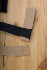
The first thing you need to do is cut some cardboard strips as wide as each side of your flashgun and about 4 or 5 inches long. You'll end up with two fat strips and two thin strips. Then cut them where your hinge is going to go. Its going to be about half an inch from the end so that you can fit some velcro to it. The image on the left shows the two thin side pieces.
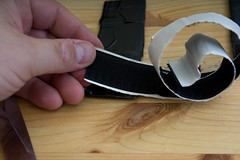
For your next trick you will need to cut some strips of foil to wrap around the cardboard. I found that wrapping a two foot strip about an inch wide around the two pieces of the hinge gives enough stiffness to make it work nicely. The image on the right should give you an idea of what I mean. Then you can carefully wrap velcro around the whole thing to make it look like a sticky mess professional.
Your final task is to add some velcro hooks onto the bottom of the door so that it can be attached to the flash. If you have done it all properly, the doors should bend at the hinge and stay put at whatever angle you set them to. If they don't then you probably should have used more foil.
The final result doesn't look too shabby and the individual doors can be removed if required. Because the doors aren't as wide as my ebay barn doors there isn't quite as much scope for producing a thin beam of light, but I quite like the light pattern it produces compared to the ebay doors and of course it is way cheaper and more portable than the ebay doors. It would be no hardship to keep a set in my camera bag. I think there is more tinkering that can be done with these. It might be possible to refine the shape of the doors to create wider beams or a double hinge to allow the doors to unfold to the same dimensions as the ebay doors. With something this cheap and easy to make, experimenting won't cost you a lot. Let me know if you have had a go and managed to improve on these doors.
Subscribe to:
Posts (Atom)