You are probably thinking about new year's resolutions about now. Photographically one of the more popular resolutions is to start a 365 project where you undertake to take a photo every day. Starting a 365 project is very much like giving up smoking. Giving up smoking is easy, I have done it hundreds of times. Starting a 365 project is easy, completing one is hard. In a way it is more difficult than giving up smoking because giving up smoking requires positive action to break your resolution, you have to get off your arse and spend money to break it. However a 365 project requires daily action to keep the resolution going. My own experience of starting a 365 project was not very positive and I found that in some ways it dampened my enthusiasm.
The first hurdle was remembering that I was doing a 365 project, it would get close to midnight and I would remember and then have to suddenly get creative with just a few minutes to go. The output from these nocturnal sessions wasn't exactly the best and then I would have to show these paltry efforts on flickr. If this wasn't damaging enough, actually missing a day was pretty bad. I tried to tell myself that I could set the counter back to 1 but the project increasingly became a chore that I could have done without and after an embarrassingly short amount of time I quit. I remember keenly how hard it was to give up smoking, so why introduce that sort of pain for something that I love doing?
I'm not saying that 365 projects are bad, just that you need to approach them with a modest amount of time management, perseverance and not worry too much about the output. I dare say that many a photographer has blossomed through doing a 365 project and the all or nothing nature of the project may well help them get motivated to shoot every day. Also their fear of showing sub-standard work may well push them to see better and be more creative. It also has to be said that 365 projects have a lot of support because lots of people are doing them. However there may be a better way for you.
What are the goals of a 365 project? To take more photographs? To enhance your skills through practice. To hone your vision or develop a style? These are things that you can resolve to do without the psychological burden of a 365 project. What you need is a definable goal. Something that doesn't mean failure of the entire project if you slip up. Something that doesn't require you to show your poorest quality work just because you need to meet a deadline.
So what am I going to do this year? I'm going to photograph all the streets within a half mile of my office and I'll do it during my lunchbreak. It sounds like a lot, but I managed to walk every street within a mile in just a few months, so it should be achievable. If I don't manage to do them all, its no big deal I can carry on into the next year.
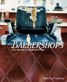
I'll only show the best shots, however I think that many of the streets will have slim pickings in terms of awesome shots. So I'm going to take a leaf out of a fabulous book called Barbershops by Tally Abecassis and Claudine Sauvé. It has shown me the way. Sometimes unpromising photographs will work if they are part of a collection, the trick is to shoot them in the same way. In Barbershops this is done to great effect, mixing straight record shots as typographies with beautiful wide, medium and detail shots to tell the story.
So I plan to do a series of typographies of items you will find in the street, for example, doors, doorbells and anything else that come to mind. These will be displayed alongside wider shots of the street and other detail shots taken with a more unique style.
The thing about this plan is that I'm not forced to do anything every day, there is a well defined goal and there is a timeslot set aside in the day for me to do it. Also I should have a unified body of work at the end of it. What could possibly go wrong?
Let me know if you plan to do something like this yourself. Or tell us your own experiences of a 365 project.
Wednesday, 30 December 2009
Tuesday, 15 December 2009
Channelling The Pre-Raphaelites
Its been quite a while since I have posted. Things have been a little too crazy at work and I have been very busy with the London Strobist meetup group, so the blog has taken a bit of a backseat while I deal with my commitments. But life is calming down now that Christmas is coming and I hope I'll have more time to post and shoot.
Back in September I travelled with my wife to Lake Vyrnwy in deepest darkest Wales to shoot a very special wedding. Jonathan and Charlotte were getting hitched in the family home in the woods by the edge of the lake. It was a fabulous setting. The humanist ceremony took place in a clearing in the woods with a fast running stream right next to it. The weather for the ceremony was touch and go, but the rain held off and there was even a glorious shaft of sunlight that came down and lit just the Bride and Groom at exactly the right moment in the ceremony.
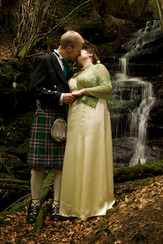
Immediately after the ceremony we went up the hill to take a formal picture of the couple in front of the waterfall. We were quite lucky it didn't turn into a trash the dress session especially as the reception was still to come. The hill was very steep the trees kept grabbing at the dress, not only that but the leaf litter was deep and the ground moist, so one slip and it would have been a disaster. But we got to the waterfall without incident and got down to taking the shot.
The aim was to get a picture of them in front of the waterfall and use a slow shutter to capture the water in flow rather then freezing it. I wanted to have everything in focus, so I didn't go for a wide aperture I started at f5.6 and a shutter of 1/12s. This meant I had to push the ISO up to 1000. It wasn't ideal and Jonathan and Charlotte were pretty dark. Fortunately I had brought along a voice acivated light stand, my wife, and she held a SB28 flash in a white shoot-through umbrella above them with the power fairly low so as not to completely overpower the ambient. From this starting point I adjusted the shutter and aperture to tune the balance between the ambient and flash and eventually settled on f6.3 at 1/6s. With hindsight I could probably have increased the aperture and reduced the ISO, but I'm very happy with the end result.
I took a few shots with the bride and groom looking at the camera, but caught this image just as they stole a kiss. I prefer it to the more formal shots. The slow shutter and flash gives the image a bit of painterly look, and I knew that the image was in some way familiar to me. Having done a little research I realized that I had been channeling pre-raphaelite medieval fantasy paintings. In particular the paintings of Edmund Blair Leighton who wasn't actually a pre-raphaelite but is often associated with them. By pure coincidence I pass the birthplace of the pre-rephaelite brotherhood on my way to work everyday.
I asked some of my my flickr buddies for comments on the photo, and they did make a number of observations about various things they would remove from the picture twigs and the like, but remembering the day, Charlotte and her family wouldn't remove any low hanging branches from the trees along the procession route even when they presented a risk to the wedding dress, so in many ways I think it would have been wrong of me to do any pruning in the photograph.
It was a fabulous wedding in a beautiful setting and though this image isn't really representative of the day, in a way I think it captures the magic of it in a way that the reportage photos don't really show. Its all about the couple in this special environment.
Posted by
Paulo Rodrigues
at
23:26
2
comments
Labels:
flash,
flash shutter synchronisation,
Light,
photographs,
photoshoot,
strobist,
wedding
Thursday, 15 October 2009
Eyes Wide Open
Something I have said on numerous occasions is that as a photographer its good to be on the other side of the lens every now and then. Like many things that are good for you, it can also be unpleasant. But you need to swallow that bitter pill, because you can learn from other people's direction and everyone deserves a decent picture of themselves. So now I jump at the chance to sit for photos whenever I can. Even more so when the photographer is an award winning photographer like Jillian Edelstein.
Now is your chance, because Jillian will be photographing 121 eyes in 12.1 hours at a central London vodaphone store. All you have to do is register and give them a photo of your eyes and you have a chance of being picked by Jillian. The closing date is the 20th November.
My first experience of being behind the lens was when I was pressed into service as a model for a photoshoot for www.trustmark.org.uk back in 2007. Yes thats me on the left dressed as a chippy. It was an excruciating experience especially when put alongside experienced models, but it gets easier every time. Though I have to admit that I'm in no rush to resurrect my modelling career.
Wednesday, 30 September 2009
Flash and a slow shutter
The one unique thing about flash that distinguishes from any other kind of light is duration. Typically a small flash will have duration of 1/500s or less which is great for freezing motion when there isn't enough ambient light to register in the exposure. But what if you mix ambient light with flash and introduce some motion? If you keep the ambient light off the parts of the image that you want to keep sharp and put it where you want it to be blurred, you can create a feeling of motion in the picture.
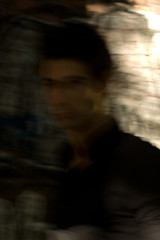
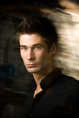
In this example taken at a recent strobist meetup, the flash didn't fire in the first exposure, which gives me the opportunity to show you what's happening. You can see in the unlit example that the majority of the image is very dark and the wall behind the model's head is well lit by sunlight. As I took the picture I moved the camera sideways to create some streaking of the image. You'll need to make sure that your sunlit portion of the image has some texture, in this case its a brick wall with graffiti, otherwise you won' get streaks. The shutter speed is 1/20s at f10 and ISO400
The flash is an Nikon SB28 in a softbox very close to the models head at about 1/4 power. I have also positioned it so that it casts a shadow over his face preventing the direct sunlight from contributing to the exposure. Its angled so that very little light hits the wall and what light does fall on the wall is very much reduced in power because the wall is much further from the light source than the subject.
The direction that the camera is moved is important because you don't want the flashlit area to merge with the bright ambient in this instance I'm moving the camera from left to right with rear curtain sync. Trying to figure out which direction to move the camera does my head in, so I just try both directions and then pick the one that works. Even though the shutter speed is 1/20s the flash fires for less than 1/1000s, superimposing a pin sharp image of his face on the dark area of the picture and the sunlit portion of the image gives him go-faster stripes.
Model Mayhem: Alex Marks
In this example taken at a recent strobist meetup, the flash didn't fire in the first exposure, which gives me the opportunity to show you what's happening. You can see in the unlit example that the majority of the image is very dark and the wall behind the model's head is well lit by sunlight. As I took the picture I moved the camera sideways to create some streaking of the image. You'll need to make sure that your sunlit portion of the image has some texture, in this case its a brick wall with graffiti, otherwise you won' get streaks. The shutter speed is 1/20s at f10 and ISO400
The flash is an Nikon SB28 in a softbox very close to the models head at about 1/4 power. I have also positioned it so that it casts a shadow over his face preventing the direct sunlight from contributing to the exposure. Its angled so that very little light hits the wall and what light does fall on the wall is very much reduced in power because the wall is much further from the light source than the subject.
The direction that the camera is moved is important because you don't want the flashlit area to merge with the bright ambient in this instance I'm moving the camera from left to right with rear curtain sync. Trying to figure out which direction to move the camera does my head in, so I just try both directions and then pick the one that works. Even though the shutter speed is 1/20s the flash fires for less than 1/1000s, superimposing a pin sharp image of his face on the dark area of the picture and the sunlit portion of the image gives him go-faster stripes.
Posted by
Paulo Rodrigues
at
07:07
3
comments
Labels:
flash,
flash shutter synchronisation,
photoshoot,
strobist
Tuesday, 1 September 2009
Phottix Strato / YN16 Trigger modification
Ironically this post was scheduled to run a little while ago and I had forgotten about it, since I wrote it I have discovered that nobody seems to be stocking these any more. But I'll leave it up in case you already own one of these and this is useful to you.
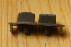
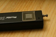
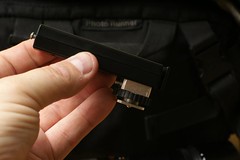
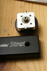
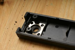
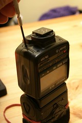
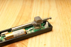
I have solved the problem of accidentally pressing the button on these triggers. One of the problems with the triggers is that the button is not recessed. This makes it difficult to build a cover for the button. So my first step was to file down the top of the button until it was level with the case. Ideally you should open the unit and take the button out, but be careful, you should follow the instructions I gave you for changing the battery to open the case, or you could end up damaging your trigger. In the picture above you can see that you don't have to take a huge amount of plastic off it.
With the button safely out of the trigger you need to sand it down until it is flush with the case. I used a dremmel tool to do this, but you could just use sandpaper and patience. Don't overdo it though as when it is flush, the button will be transluscent. If you go too far you could end up with a hole in the top of the button, so frequently test it against the case.
Now that you have it flush, you have a variety of options. You could make a tube to transport it in. This has the disadvantage of taking up space in your bag when you don't need it. I made a flip-off cover for mine. I took a cd case and cut a square of plastic out of it big enough to cover the button and the recess it sits in. Then I used a strip of gaffa tape to attach the cover to the trigger, make sure you use the low residue tape and it should be reusable. You could even use velcro, but I found it less secure and awkward.
That concludes all my modifications of the strato triggers.
Tuesday, 25 August 2009
Within The Frame: The Journey of Photographic Vision
I was very fortunate to win a load of Amazon Vouchers in a photographic contest and so I now have a big stack of books to read and review, that I might otherwise not have. One book that was recommended to me was Within the Frame: The Journey of Photographic Vision by David Du Chemin. The book is from the same stable as Joe McNally's Hot Shoe Diaries
and had a foreward from the man himself. So I was expecting the book to be good and I wasn't disappointed.
David du Chemin is an award winning travel photographer based in Vancouver and he has worked all over the world producing exquisite photographs, many of which are included in this book. In his introduction David says Within the Frame isn't a book about travel photography, but there is a strong bias towards travel photography, so much so that you would think that's what its all about. But really the book is about photographic vision and the ideas are transferable to photography closer to home. In fact if you apply David's concepts closer to home, you might find that you will look at the place where you live in a completely different way.
One thing that is really refreshing for me about this book is that it doesn't go over the technical aspects of photography in great detail, f-stops and focal lengths are touched on very lightly, only as a means of achieving a specific photographic vision, I think most people who would buy a book like this would already have got beyond the stage of wanting to know how a camera works or what equipment to buy.
What the book does give you, is real practical advice on how to tell a story with a picture. How to put together a photo-essay and communicate ideas. There are little mental exercises he gives you that will help to sharpen your vision before you even step out of the door. One thing that really resonated with me was his advice to get lost. I can attest to the validity of the piece of advice. My project last year to walk every street within a mile of my workplace led me to some interesting locations and I probably would not be reviewing this book right now if I hadn't, because one of the images that won me the Amazon Vouchers came out of that project.
Its a great little book that I think really needs digesting over more than one session. Not because its hard to read, on the contrary, it has an easy conversational style. You'll want to read it over again because there is so much in it. The pictures in it are really lovely too. To me its a great companion to Martin Freeman's The Photographers Eye, which in many ways is a bit geeky telling you how vision works. Whereas Within The Frame tells you how to expand your inner vision. I would recommend Within The Frame to anyone.
You can see more of David's Images and read his blog at www.pixelatedimage.com
David du Chemin is an award winning travel photographer based in Vancouver and he has worked all over the world producing exquisite photographs, many of which are included in this book. In his introduction David says Within the Frame isn't a book about travel photography, but there is a strong bias towards travel photography, so much so that you would think that's what its all about. But really the book is about photographic vision and the ideas are transferable to photography closer to home. In fact if you apply David's concepts closer to home, you might find that you will look at the place where you live in a completely different way.
One thing that is really refreshing for me about this book is that it doesn't go over the technical aspects of photography in great detail, f-stops and focal lengths are touched on very lightly, only as a means of achieving a specific photographic vision, I think most people who would buy a book like this would already have got beyond the stage of wanting to know how a camera works or what equipment to buy.
What the book does give you, is real practical advice on how to tell a story with a picture. How to put together a photo-essay and communicate ideas. There are little mental exercises he gives you that will help to sharpen your vision before you even step out of the door. One thing that really resonated with me was his advice to get lost. I can attest to the validity of the piece of advice. My project last year to walk every street within a mile of my workplace led me to some interesting locations and I probably would not be reviewing this book right now if I hadn't, because one of the images that won me the Amazon Vouchers came out of that project.
Its a great little book that I think really needs digesting over more than one session. Not because its hard to read, on the contrary, it has an easy conversational style. You'll want to read it over again because there is so much in it. The pictures in it are really lovely too. To me its a great companion to Martin Freeman's The Photographers Eye, which in many ways is a bit geeky telling you how vision works. Whereas Within The Frame tells you how to expand your inner vision. I would recommend Within The Frame to anyone.
You can see more of David's Images and read his blog at www.pixelatedimage.com
Tuesday, 18 August 2009
Starting a new project
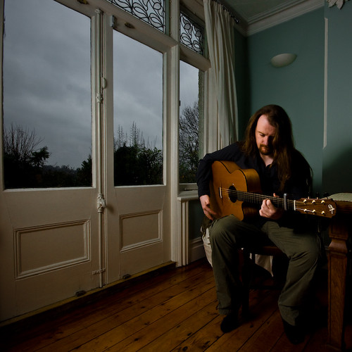
Looking back on the year, I haven't really taken enough photographs, and few of them have been of the style and quality that I want. So I have decided to embark on a new project. The project is in part inspired by one of my own images that I shot a while back, of Tom Janssen. I asked Tom to just play guitar as if I wasn't there. This was partly so I could buy some time to fiddle with my lights and take some set up shots. It was also in lieu of direction on my part and I quite liked the natural way it worked in the picture. Both Tom's concentration and the colours and drama of the lighting create a special mood to the image, that I'm rather proud of. So proud in fact that I entered it into the Taylor Wessing portrait prize, sadly I received the consolation letter today. I, like 6240 others was unsuccessful.
Prizewinning or not, this is the kind of image I want to take, so I wondered how I could turn this into a series. After many nano-seconds of thought, it occurred to me that it was a solo artist performing solo to an audience of one. So I guess that covers the title of the project. I'll call it Solo.
I'm going to scour the internet for solo artists of all kinds and ask them to sit for a portrait. Each photo will have an element of performance to it, whether they are a musician, a writer, a comedian, a poet or a painter. The mood and location will convey the idea that the artist is performing on their own.
The difficult bit is going to be finding people to sit for me and allow me into their homes. So I could end up spending more time in front of a computer looking for people and corresponding. Hopefully as the images roll in, I should build up some momentum and it will get easier to find volunteers.
With any luck I will get a good cohesive series of images some of which may even be worth entering into competitions.
Wednesday, 5 August 2009
Archeology of Elegance
When searching for inspirational photographers on the net people quite often wheel out the usual suspects when you ask who inspires them. But it sometimes takes a little more effort to find more photographers. Archeology of Elegance is filled with inspirational fashion photographers with photographs from 1980 to 2000, I guess its about a decade out of date, but few of the images look dated.
The written sections of the book offer an insight into the influences of the period but unfortunately is also so full of florid gibberish that I couldn't stomach reading it. Hey but that doesn't matter, what matters is that the book is packed with 215 illustrations from some great photographers. It even has a Terry Richardson photo that I like, which is pretty impressive. It has all the great names but also has a lot of great photographers you may not have heard of. One standout photograph for me was the velvety smooth image of Tyson Balou from the cover of The Face taken by Sølve Sundsbø. The image is retouched to hell and back but looks marvelous. I wasn't able to find an exact copy of the image but have used one from the same set, above.
The book isn't broken down by date as you would expect but it is split into sections based on the types of image. Glamour, Punk Rock, High-Tech and Futurism and Art. It scatters the photos through these sections without a timeline and rather bizarrely also includes some images from the 60s and seventies. There are some stunning images in here and there is a wide varieties of style to choose from.
I would recommend this book to anyone interested in fashion photography to use as a basis for further study. I like it very much.
Wednesday, 29 July 2009
Strato Trigger Modification
One of the weaknesses of the Phottix Strato triggers is that the shoe isn't a great fit and it doesn't lock, so I decided to use one that needed repairing, to experiment with a case modification. I found that Sonia do an excellent replacement hotshoe for the Vivitar 283/285. It has a PC sync socket and a test button and can be very easily be attached to any case that has room for a hot shoe. The strato trigger doesn't have enough room to replace the hotshoe that it comes with but with a little imagination the hotshoe can be placed on the front of the trigger so that it can be mounted horizontally.
Thats all there is to it. It took me a while to get it done and the dremmel tool made it sound like a trip to the dentists, but it wasn't terribly difficult and I won't suffer any embarrassing connection problems.
Posted by
Paulo Rodrigues
at
09:00
1 comments
Labels:
DIY,
flash,
flash shutter synchronisation,
gear,
strobist
Saturday, 25 July 2009
My Favourites from Flickr
Flikriver has a rather neat little badge creator that can grab thumbnails from various aspects of your flickr account and make a wee display of them. Ive got enough of my own photos showing here, so I thought I might show you some of the photos that I have marked as favourites. You can click through to see more.
Tuesday, 21 July 2009
Figure Ground Confusion
A while back I wrote about a concept called shared boundaries which causes the perspective of an image to collapse. You can read it here. This concept didn't come to my head unbidden, oh no, I read about it in a awesome but extraordinarily dry book called Perception and Imaging: Photography--A Way of Seeing by Richard Zachia. In fact the cover of the book has a good example of the collapse of perspective.
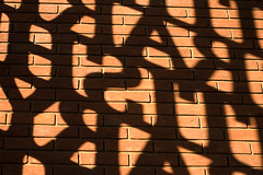
Another concept from the book is figure ground confusion I touched on this briefly in the previous post. When you look at a picture, you usually quickly establish which part of the picture is the background and which is the foreground, but some images make it hard for the brain to establish this and the foreground and background will flip-flop.
The image above is an example of this. I took it at the gates of the British Library. I have no idea if this works for you, but for me there are three graphical elements working to create a figure ground confusion. The first and most obvious is that the light and shade competes to be the foreground. As I study the picture, the letters grab my attention first because writing is a strong attractor, then the bright spaces between the letters takes over and my perception flips between the two. But the third element that takes over is the pattern of the bricks and this can jump to the foreground and relegate the light and shadow to the background.
Perception and Imaging: Photography--A Way of Seeing is a great book, but I have held off writing a review of it because it is so dry. After I have given it its third reading, maybe I'll write a proper review.
Posted by
Paulo Rodrigues
at
09:00
0
comments
Labels:
books,
Composition,
perception,
photographs,
theory
Thursday, 16 July 2009
Not A Crime
The British Journal of Photography has started a campaign to highlight the erosion of photographer's rights worldwide. They will be collecting thousands of self-portraits of photographers from around the world each holding up a white card with the words, ‘Not a crime’ or ‘I am not a terrorist’.
If you are reading this blog, you are probably a photographer, so what are you waiting for, go put your self-portrait in their Flickr pool. Read More
Tuesday, 14 July 2009
Nikon SB28 Foot Repair
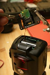
I learn't a valuable lesson at the last London strobist meetup. I was walking around with my flash attached to my monopod and the strain was too much on the plastic foot of the hotshoe and it tore off. I wasn't a happy bunny, but fortunately those chaps at Nikon carry spares for the SB28 flash and within a day I had a brand new plastic part in my hand for less than a tenner. Of course I could have taken lots of photos of the repair process, but I'm a pretty impatient guy and just wanted to get on with it so I didn't document the process. But it turned out to be relatively easy. Seeing as I'm a nice guy I took it all apart again, just so I could show you how to do it.
The tools you'll need are a jeweller's screwdriver and much smaller fingers than me. If you do things in the right order it should be a pretty quick repair.
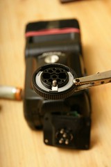
The first thing you should do is make sure that the locking ring is rotating normally. I didn't do that and ended up having to re-attach the foot so that I could get enough leverage to move the ring. If the ring is locked up you can use a pair of pliers or a wrench to get it moving again. Be careful not to use too much force or you could cause more damage
Once you know what you are doing its a pretty simple repair to make and very inexpensive too. If you need spare parts contact the Nikon Spares department at spareparts@nikon.co.uk
Monday, 13 July 2009
Egg!
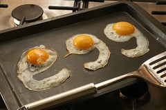
I love eggs, boiled, poached, fried, scrambled and most definitely un-fertilised. So when the strobist food assignment came up, I immediately thought of eggs. Actually to tell the truth eggs are really just a condiment to have with bacon. OK I admit it, I actually thought of bacon first, but realised I wouldn't be able to hold off eating it long enough to photograph it. So eggs it had to be.
The funny thing about the strobist competition is that its about lighting but though lighting is very important in food photography, what really stands out is the styling, composition and choice of colours. I looked through my Contact Food and Drink Photographer books to get some inspiration and one of the things that struck me was that the photos that I liked the best had colours that linked the subject and the background. For instance Peter Cassidy on page 28 picks a colour from the subject and uses it in the background. The rust colour in the pears, or the peach stone in the peaches
These contact sourcebooks are full of inspirational photos, and they are free to view online. I had lots of ideas about what I wanted to do but not really enough time. I'd have loved to have done some high end shots like the ones in the books but I didn't really have time, though it has to be said there are lots of very clean simple shots entered into the strobist assignment that didn't take a lot of investment in backgrounds or ingredients.
I don't know when the idea for the eggs came to me. I was vaguely considering shooting a cooked breakast like Laurie Evans' photo for M&S but TBH we don't have lots of photogenic food at home. I'd have had to go shopping. But then the egg idea came to me, and it meant I could just use stuff I had at home.
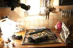
Styling the egg was quite difficult and required a fair amount of patience, most of the effort went into the styling. Egg yolk is a gel, its semi-solid, So you cant just crack an egg and then move the white into position. You could start cooking the egg and pull the uncooked yolk around, but I felt that it wouldn't look right. So what I did was to separate the egg white from the yolks by tipping the yolk from one half of the shell to the other. Then I took a small paint brush and painted the letters on the tray with egg white. Then I had to carefully spoon more egg white onto the painted portions to thicken it. Egg White likes to stick together, so the spooned egg white flowed around the letters. Once I had built up the thickness, I used the paintbrush to push the white out to round off the letters a little. With this done, the final step was to turn on the heat and place the egg yolks in position.
You have to work quickly once the eggs are cooked because they can quickly dry out. By the next morning they were all curled up. So I didn't spend a great deal of time perfecting the lighting. I would really have liked to have finessed the light a bit better, maybe had bigger highlights on the egg yolks, but it was getting quite late by this point. The cramped conditions would have made it difficult to set up umbrellas and softboxes, so I used white plastic chopping boards and reflected the light off of them. I used two small flashes one pointed at a chopping board behind the tray and the other on the left hand side. I also set up a small piece of foil on the right to add a little fill.
I don't expect this to win the assignment, but its generated a lot of interest. Last time I looked it was sixth on page one of explore, which is kind of nice. It was a lot o fun to do and I would like to do more food photography in the future.
Sunday, 12 July 2009
My Wishlist
I'm going to be turning 40 this year in a month's time. Here are a few photography related books I have on my wishlist. This is for my family and friends who want to get me nice things, but if you want to get me something I wouldn't look you in the mouth :)
Thursday, 9 July 2009
Changing the battery on the Phottix Strato Trigger
If you own one of these triggers (Also known as the YongNuo YN-16), at some point you are going to have to change the battery. This moment came quite quickly for me because the button was accidentally held down in my bag and the trigger was completely dead when it came time to start shooting. Fortunately I always carry a spare so it wasn't a disaster.
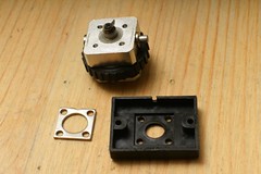
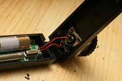
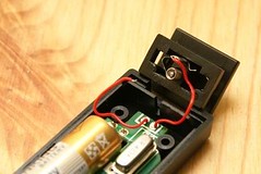
Changing the battery however can be a disaster. The reason for this is that there is a component called a bastard spring. If it comes lose you will understand why it is so named. The bastard spring is used by the centre pin of the hot foot and once it pops out of its slot it is very difficult to put it back in without breaking the soldered connection to the circuit board. If that happens, the trigger is going to be junk unless you are very good at soldering.
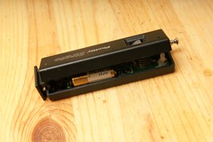
So I'm going to show you the proper sequence for changing the trigger battery without ruining your trigger.
Step Three: Change the battery. If you haven't glued the hot foot to the cover, you need to be careful doing this as it is far too easy for that bastard spring to pop out
There you have it, be very careful and you should have no problems. I'm planning on doing a post at some point on how to modify the trigger so that the test button won't get pressed accidentally. It will probably involve velcro. But you could just leave the test button off completely if you don't use it.
Changing the battery however can be a disaster. The reason for this is that there is a component called a bastard spring. If it comes lose you will understand why it is so named. The bastard spring is used by the centre pin of the hot foot and once it pops out of its slot it is very difficult to put it back in without breaking the soldered connection to the circuit board. If that happens, the trigger is going to be junk unless you are very good at soldering.
So I'm going to show you the proper sequence for changing the trigger battery without ruining your trigger.
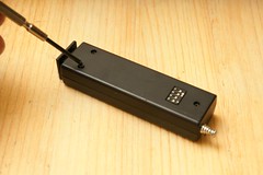
Step One: Turn your trigger face down and undo the screws. Carefully remove the screws without pulling the two halves of the trigger apart. |
Step Three: Change the battery. If you haven't glued the hot foot to the cover, you need to be careful doing this as it is far too easy for that bastard spring to pop out
There you have it, be very careful and you should have no problems. I'm planning on doing a post at some point on how to modify the trigger so that the test button won't get pressed accidentally. It will probably involve velcro. But you could just leave the test button off completely if you don't use it.
Posted by
Paulo Rodrigues
at
23:47
1 comments
Labels:
DIY,
flash,
flash shutter synchronisation,
Tips
Thursday, 2 July 2009
Have Some Pride
Its The Pride London Parade this weekend. Of all the parades I have photographed over the years Pride London is the highlight of them all. What makes Pride London so special is that everyone there actually wants to be there, and not only that, they want to have a great time. Other parades the people are usually there because they are obeying orders or they are obliged because they got flown out from the states at great expense and now they are in cold grey miserable London when they would rather be back at the hotel snorting coke off a cheerleader's tits.
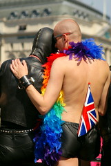
But at pride, no matter the weather, everyone has a blast. The last time I was there it rained so much that my viewfinder and lenses fogged up and I missed the actual parade while I dried off in a nearby pub. Fortunately I had a press pass and got some good pictures in the pit in front of the stage at Trafalgar Square. The highlight for me one year was when I was able to persuade the leather clad conductor of the open topped Motor Sports Club bus to let me on board and I got the above [insert adjective of choice] image.
Sadly the day clashes with so many other commitments of mine that I haven't been able to go for the last couple of years. So I would like you to go in my place this year and bring me back some pictures. The weather promises to be good this year, so you'll see lots more people. Arrive early at the assembly point in Baker Street and you can get some images of people getting ready for the parade. There are loads of characters, but you might have trouble getting any candids as anyone who sees a camera will immediately play up to it. You strobists can take your gear along and do some portraits, you'll find more receptive people than anywhere else. Take your business cards along too because you might sell some prints.
In previous years the parade route has been quite porous, I saw plenty of people without passes walking the route, so you should be able to slip through and get the odd shot. Try to get a variety of shots not just portraits but wide shots that show a sense of place. Shoot the crowd you should get some great reaction shots and there will be a few interesting characters lining the route.
Let me know how you get on and have fun, fingers crossed for good weather. If you want more information about pride London go look at the website
Thursday, 25 June 2009
Speedlights and Speedlites
I've decided what I'm going to spend my Amazon voucher on. Focal press recently published a new book "Speedlights and Speedlites"
Written by a trio of Bostonian photographers Lou Jones, Bob Keenan and Steve Ostrowski,the book is all about small off camera flash and it looks kind of interesting. By the sounds of it its going to have some proprietary information about Canon and Nikon flash and promises to have diagrams. You can download a few sample pages from the focal press website for a little preview
Thursday, 18 June 2009
Olympus EP-1 Does it go far enough?
Wow it feels like ages since I wrote anything on the blog. I guess I just haven't had time recently. Too many projects and I'm likely to be pretty busy right up into October. Today is going to be a bit of a departure for me. I don't write about kit usually, but I think the new Olympus EP-1 is something to talk about. But first some history
My first proper camera was an Olympus C5050z. It was a small bridge camera that I bought because it had manual controls and an inexpensive dive housing. It was a pretty cool camera. It had a 35-105mm equivalent zoom lens that was f1.8-2.6 and had a flippy-flappy screen (I don't think that's the technical term).
One of the best things about it was that you could pre-set the focus on manual using a distance scale in feet or meters. Combined with the custom modes, it was possible to pre-set the camera at the hyperfocal distances for each aperture and focal length, then you could guarantee that pretty much everything would be in focus. This was very useful for diving, because it meant you could shoot without any lag and be sure to get the fish in focus. Magnum photographer Alex Majoli found this useful when he was out and about in various war zones. Not only were the cameras tiny, but he liked having lots of depth of field. The tiny 7.1mm lens on the C5050z means that even at f1.8 everything from about 8 feet away can be acceptably sharp.
In his interview with Rob Gailbraith Alex Majoli said "I miss the strongest of the old generation cameras -- Olympus OM-1, the Leica. The dream would be a digital camera the size of the C-5060 -- not bigger than a Leica, let's say -- with exchangeable lenses. Small lenses. I would like to see fixed lenses, not zooms. Maybe some bigger apertures -- f/1.8. The file is fine. I don't need 20 million megapixels."
Well fast forward to today and Olympus appear to have answered his request. The new Olympus EP-1 is designed in the style of the Olympus pen series of cameras. The sensor size is 4/3rds which means that it has a bit more depth of field at equivalent focal lengths than a full frame DSLR and it has interchangeable lenses. I think it will be a popular camera with many photographers if the quality and handling are right. Its certainly a revolutionary camera but does it go far enough?
One of the things that attracted me to the four thirds system was that the lenses could be smaller. I think that that is certainly the case, but the other side of that coin is that you could build lenses as big as their full frame counterparts but with larger apertures. That doesn't seem to have materialised with the 4/3rds system. Just look at the C5050z with its f1.8 zoom lens. The front element is tiny, no more than 2cm across. If the Olypmus EP-1 had been built with a smaller sensor than the 4/3rds system there could have been so many interesting options not only in terms of the lenses, but also in terms of the overall package. for instance, with the smaller sensor you might have room for viewfinder or a fold out screen. Yes there are trade-offs in sensor noise and the ability to create shallow depth of field but every camera you buy involves some sort of compromise and you buy the camera you want for the job you want to do.
Still the EP-1 looks like it could be a very popular little camera and I'll be very interested in seeing what new lenses get developed for it. But will we ever see the small interchangeable lens camera that Alex Majoli dreamt up? I suspect not.
Thursday, 28 May 2009
What shall I review next?
I'd like to thank everyone who has bought items on referal through the amazon links on this blog. In the space of a year, I am about to earn my first £25 gift voucher through referal fees from Amazon which means that I should be able to afford a new book or two to review. So whether you are planning on buying that new Nikon D90, a New Umbrella or just a set of Ball Bungees buying through this website means I can buy more books to review.
So seeing as I should be getting a voucher in the near future, I'm open to suggestions on what to review next. Drop me a comment with your suggestions and I'll consider getting a copy.
Friday, 22 May 2009
Hot Shoe Diaries
I read this book cover to cover the day that it arrived. I was fortunate to have a business trip which gave me a good 6 hours to plough through it, but I didn't write a review straight away, I wanted to digest it and I'm now on my second reading of it. What make this book so great? It has to be the writing style, if anything Joe is even more crazy than when he wrote The Moment It Clicks. The sheer entertainment value of this book makes it valuable because you'll read it over and over again, and I'll bet you'll get something new out of it every time.
Joe is constantly drawing parallels with cookery in this book, but this is no recipe book, you won't see a list of ingredients anywhere. Joe is the Jamie Oliver of small flash lighting, its all motor mouth wisecracking and fluid instruction, a little dash of this a little dash of that. Its all about adapting to the situation you're in and mixing your lighting to taste.
The book starts with a comprehensive yet compact section on gear. Joe shoots with the Nikon creative flash system and the book has Nikon CLS running through it like a stick of rock, but that doesn't diminish the book's usefulness to anyone who doesn't shoot with Nikon flash or even TTL in general.
The hot shoe diaries is full of solid case studies with a variety of different shots and techniques, lots of good information on shooting with hard light and with the flash on and off the camera or even outside the building and all discussed in Joe's quirky style.
At the end of the book a guy in a gorilla suit gives you a quick run down of how to program your Nikon flash guns to do wireless using the SB800,SB900 and on camera flash as examples.
You may find that you recognise a few of the case studies from Joe's blog, but that's no bad thing, because your not going to read the blog in the bath, and with it in book form you'll read it over again.
This is definitely up there with my favourite books and excellent value for money. Buy it, you won't regret it.
Sunday, 17 May 2009
Phottix Triggers and Hasselblad
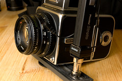
One of the disadvantages of the Phottix triggers that I recently purchased is that they don't have a socket for sync cable so if you have a camera without a hot shoe your going to have a spot of trouble jamming the hot foot of the trigger into the sync port of the camera. Fortunately I had a kaiser hot shoe with a PC cord knocking about so I was able to plug that into the PC port on the lens of my Hasselblad.
So far so good you might think. I wind up the Hasselblad, trip the shutter and FLA-DAP! no flash. It turns out that the foot on the trigger doesn't play nicely with the Kaiser. The trigger foot has the centre pin off centre, so you have to put it into the foot wide end first. Your probably going to want to tape that connection because there is no locking pin.
With the trigger hanging off the camera its not going to be a terribly reliable connection, so you will need to get some sort of bracket to attach it to the camera. You can get an accessory shoe that will fit on a Hasselblad but I used a flash bracket off a Metz potato masher. It attaches to the tripod socket on the bottom of the camera and a tripod post can be mounted into one of the holes on the bracket. There you have it, its not pretty, but its functional.
Posted by
Paulo Rodrigues
at
23:54
0
comments
Labels:
flash,
flash shutter synchronisation,
gear,
hasselblad,
strobist
Monday, 11 May 2009
Lighting By David Prakel.
Part of the Basics Photography series of books, Lighting is much more and at the same time much less than I was expecting. This book really attempts to cover absolutely everything to do with lighting, starting with a very comprehensive section on colour theory which really does cover pretty much everything to do with colour, even using colour filters for black and white photography. The book then goes on to discuss exposure.
The section on exposure skimps on the relationship between shutter and aperture, which is presented as a table with exposure values. Later on the book talks about reducing exposure by a stop or increasing by a stop but doesn't explicitly say that doubling the shutter speed will increase by a stop. The information is there in tabular form, but it isn't very friendly for someone unfamiliar with the mechanics of shutter and aperture. For my money it wasn't a great explanation of exposure.
There is a very good section on metering which covers all kinds of metering including using your hand as a meter and adjusting for skin tone. There is also a section on contrast and subject brightness range which is very useful. Including a diagram on how to control subject contrast with lighting ratios.
There lots of great information on controlling light with filters, graduates and polarisers and also on IR and UV light. The book goes on to discuss natural light lots of information about time of day, and seasonal light, but doesn't really touch on direction much.
The section on photographic lighting, covers continuous and flash lighting and describes different types of lights even including chemical flashbulbs. There are some good lighting recipes in there and a some good instruction on direction of lighting, but it low on the theory that enables problem solving.
The final chapter is on techniques like painting with light, using a flatbed scanner as a capture device and even shadowgrams and photograms.
Its an ambitious book, which contains a lot more than I would have expected from it, but the enormous breadth is at the expense of the depth that would have made this a great resource. Sure there is a lot of information to be gained from this book especially if you are a beginner. Learning the vocabulary and having a full picture of what is possible might enable you to target your education or send you off in directions that you hadn't imagined before.
Subscribe to:
Posts (Atom)